Good Example
This is a good example of the use of typography in different languages because it uses different typefaces. Like the use of the typeface ‘Impact‘ for the thank you ‘MERCI’ and many other typefaces. This piece of work is all about saying thank you in different languages. Using such a bold typeface such as ‘Impact‘ immediately draws the viewer’s eyes to the middle of the work and using a thank you such as ‘Merci’ that is instantly recognisable makes the viewers to instantly realise what the work is about and what it’s trying to communicate. Using different sizes for the different thank you’s makes the piece not look too busy and overwhelming for the viewers. It also creates a hierarchy that guides the viewer’s eyes from the middle of the work to the second biggest thank you and then the next size.
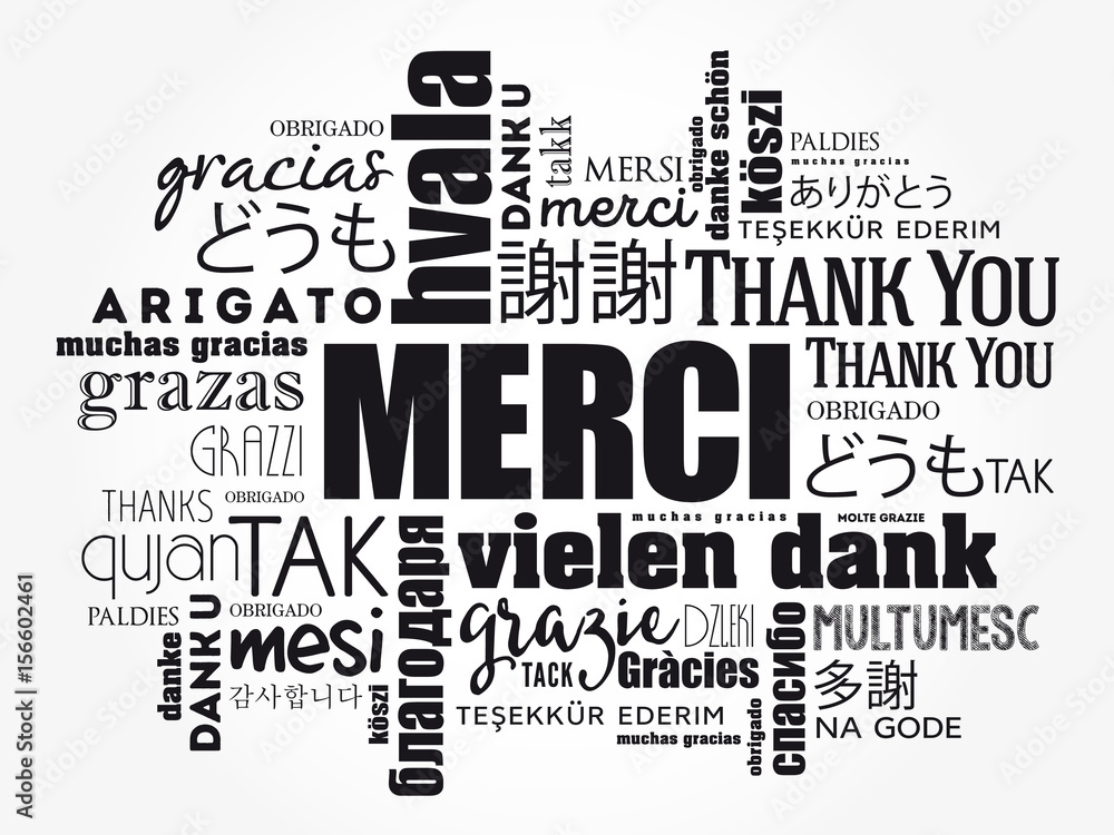
Using the contrast of the white background to the black lettering makes all the thank you’s pop out more which makes the viewers immediately be drawn to this piece of work and stop to look at it. The viewers for this piece are foreigners. The piece uses a variety of different nationalities and languages which makes for quite a large group of audience. This means that more foreigners are likely to recognise their a thank you in their own language which will make them stop and look at the work. It makes viewers that might feel more forgotten about like Bulgarians feel more included and recognised since there is a lack of recognition with Bulgaria. The fact that the different fonts are different thicknesses and spacing between the letters makes the piece not to feel overpacked and it allows each different languages to shine in their own way and not be overshadowed by others.
Bad Example
This is a bad example of the use of typography in different languages because it’s too busy and the viewers don’t know where to look. That is because of all the different colours and typefaces. Whereas, the usage of different typefaces worked in he good example it doesn’t in this case. Due to every single thank you being in very different fonts, it look busy. The fact that the words are all in the same size is also distracting the viewers eyes, it doesn’t allow for the contrast between the different words. Another problem with this design is that it lack of composition, instead of having all the words surround each other the composition should help the hierarchy of the piece. If the design had one of the ‘thank you’ into a bigger font it will create a focal point which will immediately grabs the viewers eyes and it will help guide them through the piece.
Bad Example
My Redo


When I redid the design, I did not use that much different languages because I did not want to make the design busy like the original. Instead of using all different type of colours, I used two different shades of blue. Light blue and dark blue, using different shades of the same colour allows the piece to not feel overwhelming and the colours don’t take away from the message. As well as changing the colours I also sticked to two different fonts. ‘Big Caslon Medium’ for the dark blue which is a fancier font and ‘Krungthep’ for the light blue which is a more of a in your face type of font. The different fonts make it so the piece isn’t busy but it also gives contrast to the different words. Finally, I made the most recognisable ‘thank you’ the biggest size to immediately bring attention to the middle and then used different sizes and placing them in a way to guide the viewer’s eyes.
Dizain. Merci (Thank You in French) Word Cloud background, all languages, multilingual for education or thanksgiving day. Adobe Stock. Available online: [https://stock.adobe.com/uk/images/merci-thank-you-in-french-word-cloud-background-all-languages-multilingual-for-education-or-thanksgiving-day/156602461
Edelisa. Say Thank you in different languages Sticker. Redbubble. Available online: [https://www.redbubble.com/i/sticker/Say-Thank-you-in-different-languages-by-edelisa/63748751.EJUG5]