Good example
This is a good example of the use of colour in graphic design to represent struggles of communicating when you don’t understand each other because, it uses the same colour scheme for the whole design. the colour scheme of purple, using different hues and shades of the colour. When using different hues and shades go the same colour for the full design (which some exceptions like the white and orange) it makes the design come together. Using the pastel purple as background makes the darker colour used for the plants and clothes of the people pop out more. The use of white for the tops of the people makes the viewers eyes immediately notice them first due to the contrast with the pastel background. It makes the people the focal point of the design. Also, the use of colour in the design creates composition and hierarchy that guides the viewers eyes through the design.

When using the same colour but different hues for the whole design it adds layers for the design. The fact that the darkest purple is used for the people’s clothes and using white that pops makes them the first thing the viewers see then its the scribbles in the middle which shows the people being unbar to communicate with each other. The fact the design doesn’t have nay text but it still porters the struggles of not being able to communicate with other people shows that not every design needs to have text to represent an issue. The composition of the design is also good because, the colour and placement of the people, plants and scribbles create a hierarchy of the design that guides the viewers eyes and creates a focal point. Overall, this is a good design because it uses the affective colour scheme to portray a message.
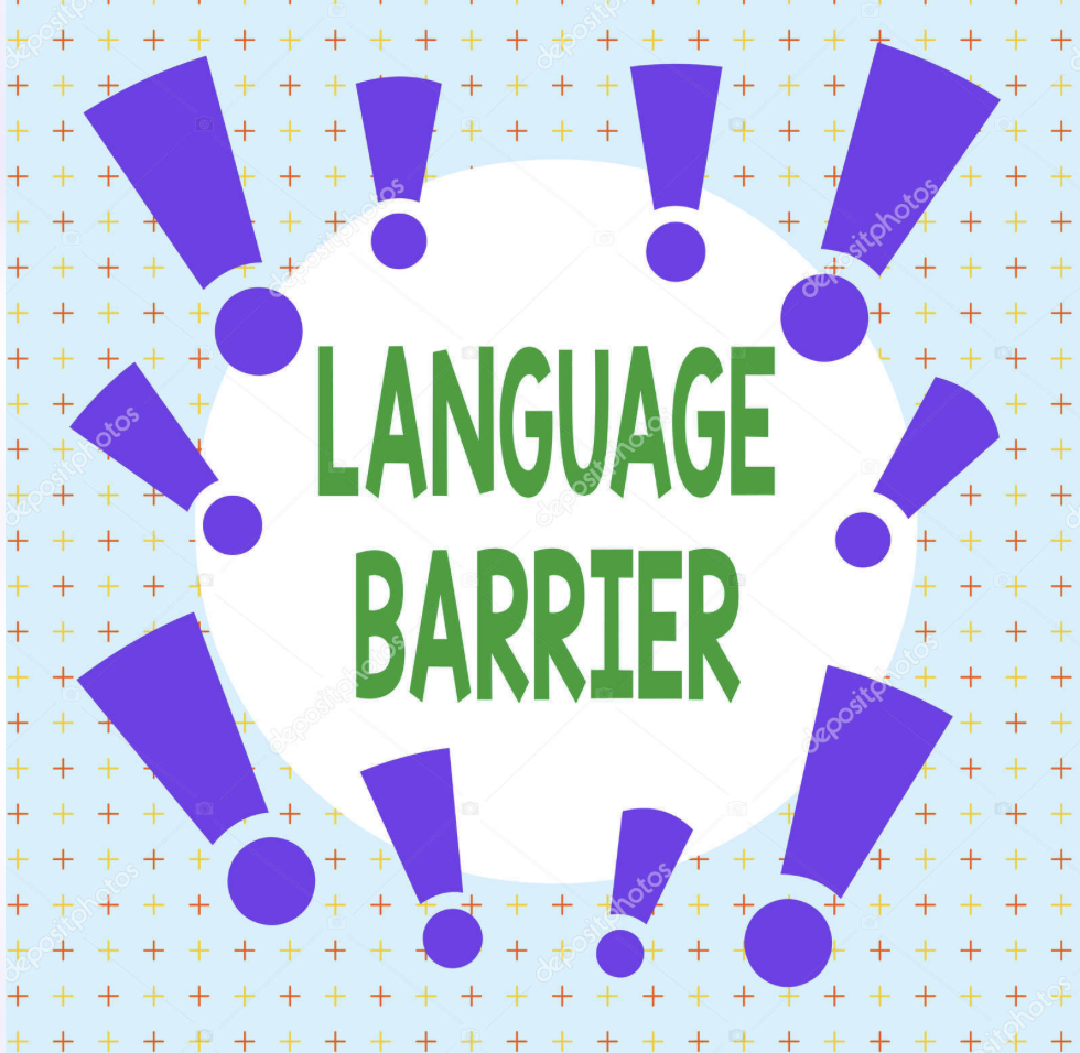
Bad Example
This is a bad example of the use of colour to portray language barriers because, it doesn’t use an affective colour scheme. Th purple exclamation marks are bold and are the first thing that catches the viewers eyes, it distracts from the main point. The light blue background with yellow and red pluses is also distracting and confusing since it doesn’t add anything to the design and it doesn’t create composition or contrast to guide the viewers eyes. The font used for the text is quite simple and basic. There are too many different colours that distract the viewers from the actual message and it doesn’t have nay real focal point or hierarchy. It overwhelms the viewers eyes from all the different colours and design going on especially in the background.
Bad example
My Redo
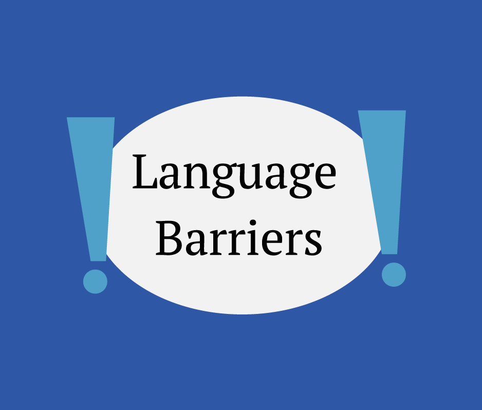
When I redid the design, I focused on changing the background and making the design simpler and minimalistic. I used dark blue for the background to make the white circle with text pop out more and be the focal point of the design so the first thing the viewers see it’s the text and understand the point of the whole design. I also used light blue for the exclamation marks to bring even more attention to the text bubble. Unlike the original I only used two exclamation marks because I didn’t want to ovewehelm the design like how the original did. Using a simple plain background creates a hierarchy that draws the viewers eyes to the text blue first, then the exclamation marks. I also changed the text colour to black to add more contrast against the white bubble text.
Treety (2022). Problems in communication vector concept stock illustration. iStock. Available online: [https://www.istockphoto.com/vector/problems-in-communication-vector-concept-gm1406124833-457790101]
Artursz. Text sign showing Language Barrier business photo showcasing difficulties in communication Speaking different language Asymmetrical uneven shaped format pattern object outline multicolour design. Depositphotos. Available online: [https://depositphotos.com/photo/text-sign-showing-language-barrier-conceptual-photo-difficulties-in-communication-speaking-different-language-asymmetrical-uneven-324246364.html]