Good Example
This is a good example of composition for language barriers because it uses a unique way to represent language barriers. It’s a video created by the University of West Attica and it’s a short 1.14 minute film about the struggle with language barriers. The snippet of the video I chose is at the start. Different language are used to create a wall with different words from those languages. This is a brilliant idea and use of composition to create a visual way to communicating the message of language barriers to the viewers. The way the different words in different languages are used to create a wall represents the language barrier itself. There are two people used at both sides of the wall of languages to represent how language barriers can stop people from communicating with each other and the struggle people with languages barriers ace.
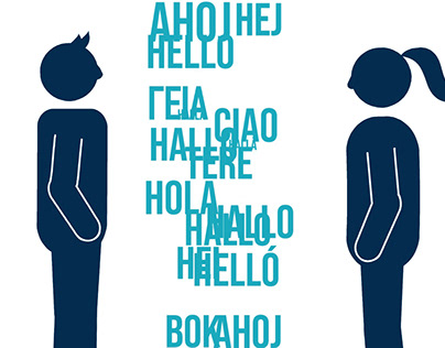
(A screenshot from a video about language barriers.)
This is also a great use of typography, with the font of the text being quite simple and bold at the same time which helps the video to not feel overwhelming. The different words also show how many different languages there are out there. It’s a good conceptual design as well since it used the idea of a wall and communicating and combines them together. This makes the viewers immediately understand the message behind the video even if they don’t know what it was about at the start. The simple use of colours with light and dark blue also keeps the simplistic feeling of the video. Overall, it’s a very well executed use of composition that helps the viewers know what the work is about and the message it tries to communicate.
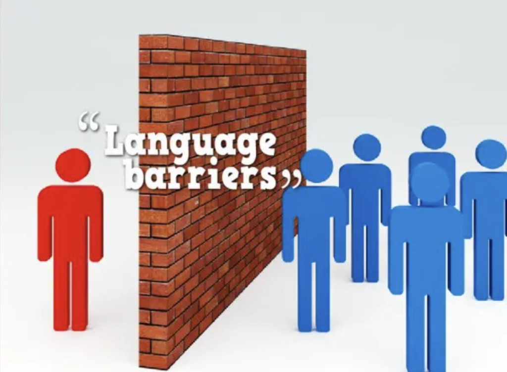
Bad Example
This is a bad example of composition in language barriers design because the position of he typography doesn’t look right. That is because the background is white and the text is also white which can make it difficult for the viewers to read it (especially if they’re far away.) The placement of the text throws off the whole composition of the design. As well as the placement of the text, the font used isn’t the best choice either because of how how simplistic it is. The fact that the typography is in the middle also throws off the focal point of the design, if the typography is the focal point that the designer wants it to be the first thing the viewers see then it shouldn’t be placed in the middle because it throws off the hierarchy and composition of the whole design.
Bad Example
My Redo
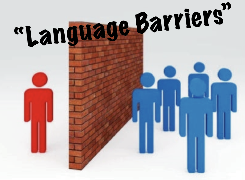
When I redid the design, I only focused on the typography because it was affecting the composition of the design. I changed the font to ‘Marker Felt’ to make the text pop out more. As well as changing the font I also changed the colour to black to create contrast against the background and the text. The focal point of the design is the text that immediately catches the viewers eyes. With the text being black and tilting slightly to the left it creates hierarchy that guides the viewers eyes. The first thing the viewers notice is that bold text, then they look at the wall and the people. Overall, the change of colour, placement and font makes the text pop out more and catches the viewers eyes easier to make them stop and look at the design and its message.
Marianna Simota (2023). LANGUAGE BARRIER. Behance. Available online: [LANGUAGE BARRIER on Behance]
Language barriers. Microsoft Bing. Available online: [language barriers graphic design – Bing images]