First Design
When doing my first illustrator portray I used only circles for the whole portray. The choice of circles over other shapes is because circles don’t have sharp edges and that allows for negative space around the circles. The negative space helps the design to not look overwhelming and busy for the viewers. I used different shades of brown to highlight the shadows and the darker the shades the darker the brown becomes. This adds depth to the portray and it stops it from looking simple and plain.
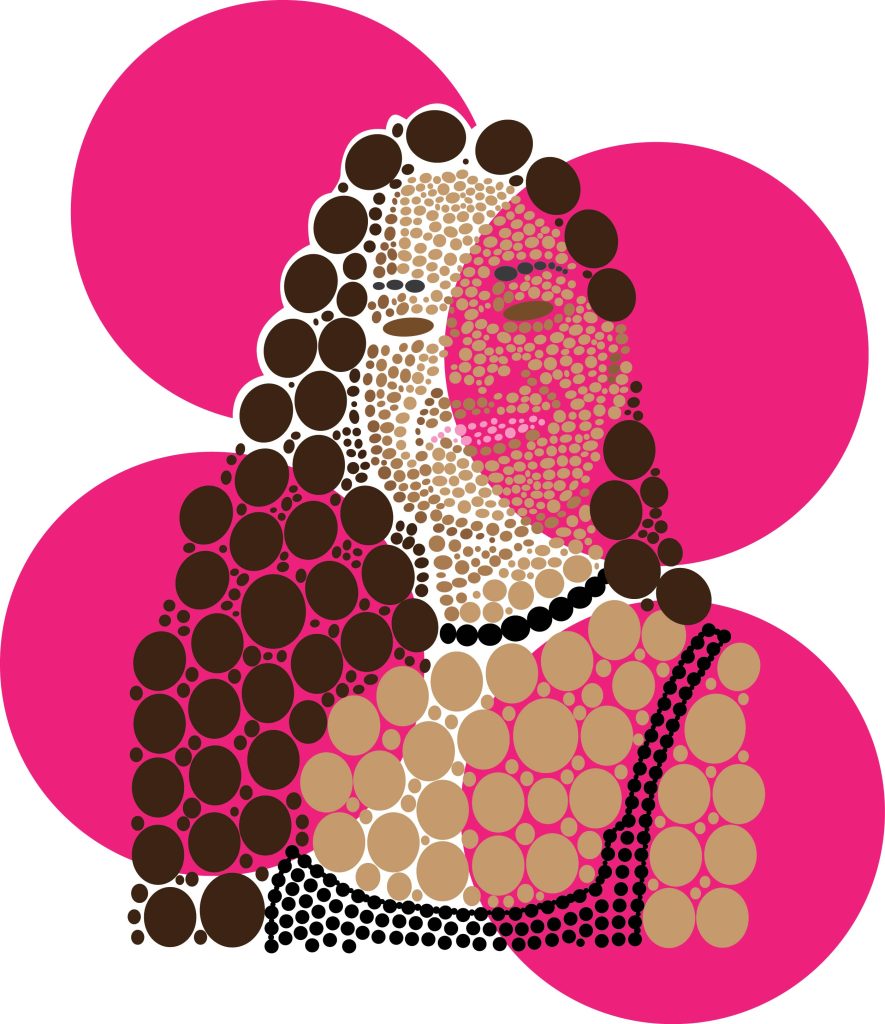
I also used big circles for the background to continue on with the circle theme of the design. The choice of hot pink for the background colour of the circles was to make the whole design pop more, with the bold colour from behind making the light colours of the skin come out more in the final design.
Second Design
For my second illustrator portray I wanted to do a more sketch looking design. To achieve that I used the control panel and traced the imagen chosen. Then when I was satisfied with the 3 different colours that highlight different shadows, I went to stylize and then scribble. After going to scribble there was some experimenting on a rectangle to get used to do the settings and different lines.
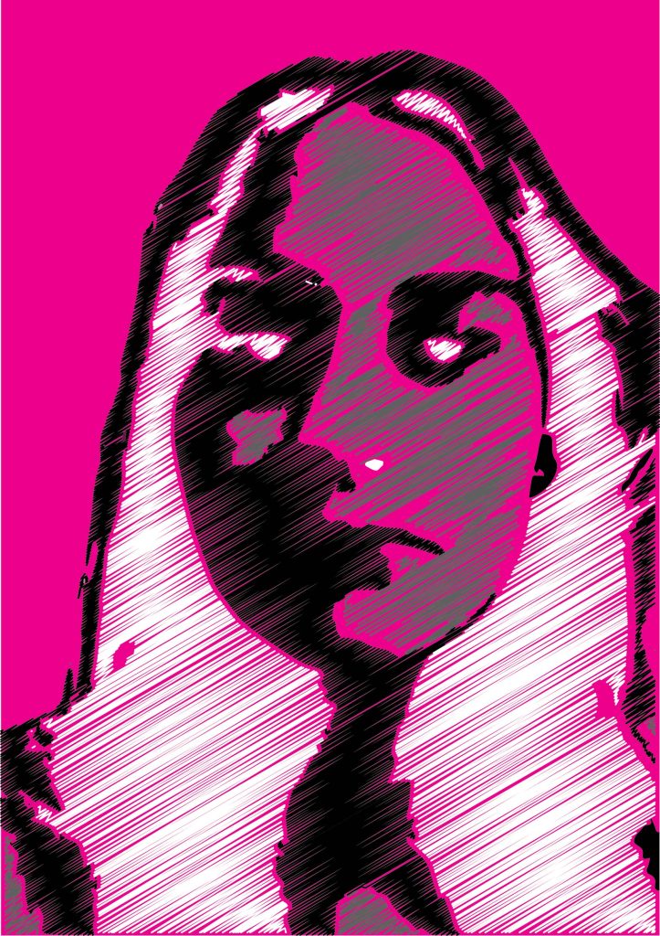
I chose the lines to have space in between them so that it creates a more scribble looking effect for the design. Instead of using more bold and colourful colours I decided to stick with the white, black, and grey because they best highlight all of the parts if the face and makes it instantly recognizable where the eyes, nose and chin are. To make the design pop more and make the details be seen more, the background is a bold hot pink colour to help achieve that goal.