Name for the logo

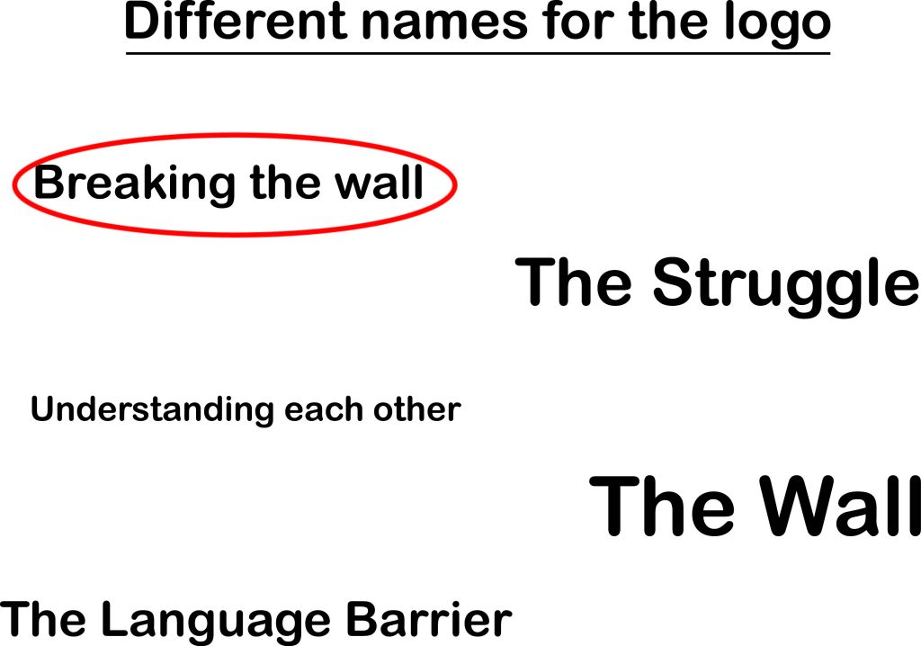
When deciding on a name for the logo I was thinking of 5 different options. I wanted the name to be conceptual, so it needed to have two ideas combined together to create the perfect name for the logo. The whole purpose behind the website is to educate and inform people about the struggles of language barriers and how to overcome those barriers. When thinking more in depth about it, at the end the idea that came to mind was a wall that stops people from communicating and the whole purpose is to break that wall which is why the name ‘breaking the wall’ was chose.
Different designs for the Logo

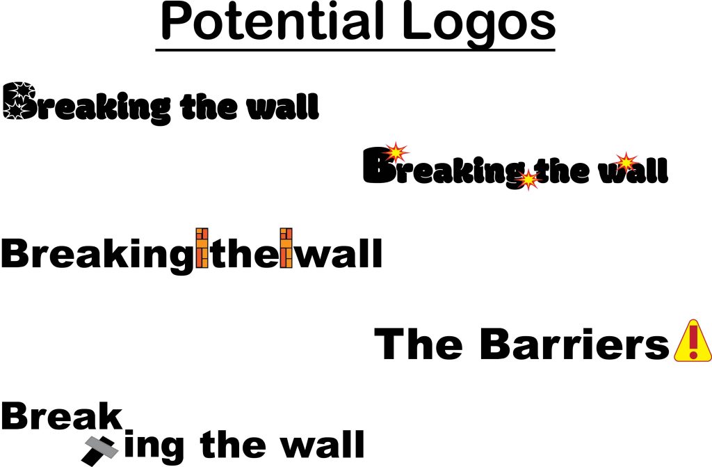
After the name was decided there were a few ideas for the design of the logo. It needed to be conceptual. I wanted to work with the words ‘breaking’ and ‘wall’. To represent the breaking effect the shape tool was used to create a circle and then the manipulated to create a explosion design. A very straight forward approach was the design of walls between the spaces. At the end the design chosen was that of two explosions. There was the variation of putting the explosions inside the letters, but that idea didn’t make the final logo.
Composition for the Logo

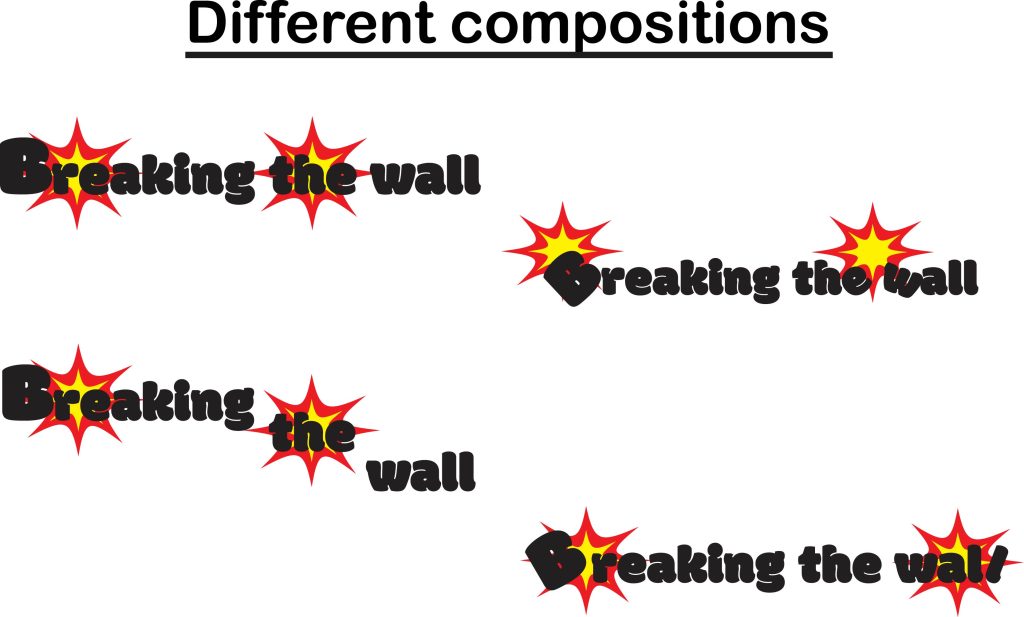
After deciding on the designs for the logo, next was the composition and where and how to place the explosions and letters. The decision to arrange the explosions at the back and make them like a background for the letters was quick. After that I played with the composition of the letters, I wanted there to be an affect that the explosions have actually moved and broken the letters. That is why where there are explosions the letter ‘B’ and ‘l’ have been slightly titled to give of the illusion that the letters have been affected by the explosions.
Colour for the Logo

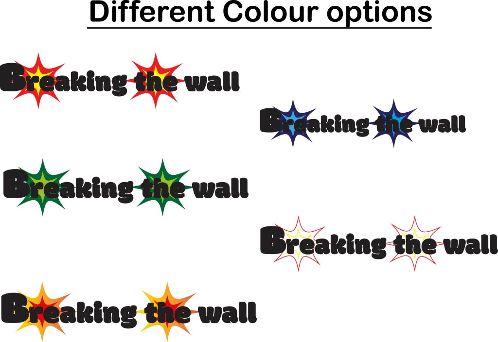
Finally, after deciding on the name, look and composition of the logo the last thing left was the colour. There was different simple colour choices such as blue and green, but also some more interesting ones such as leaving the colour of the inside of the explosions white and leaving only the outlines coloured, and using the gradient tool to make a more ombre look of the explosions. At the end the final colour was the classing explosions colour of red for the outside and yellow for the inside.
Final Logo
