Master Composition Grid
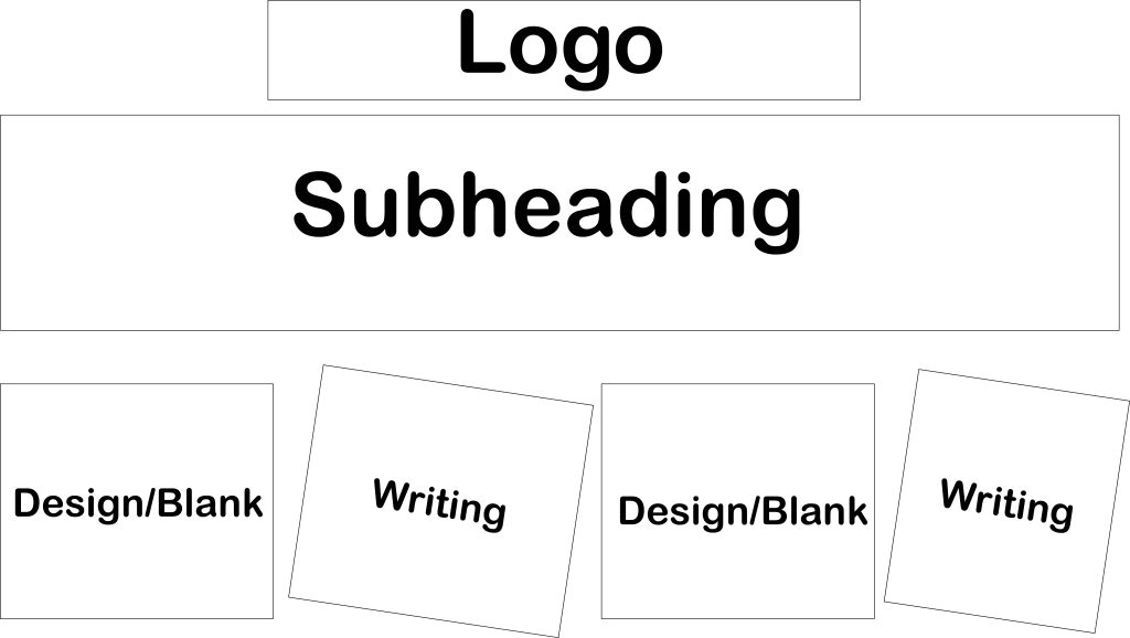
Before starting my editorial information pages I had to create a master composition grid that will be used as a template for the pages. When creating the grid I wanted to make sure the logo is always at the top, to make it easily noticeable. The focal point is the subheading that takes the top half of the page, that will make the viewers immediately know what that specific page is about. The bottom half of the page is divided with two pieces of text that corresponds with the subheading and two pieces of design to visually interpret the subheading.
Page 1
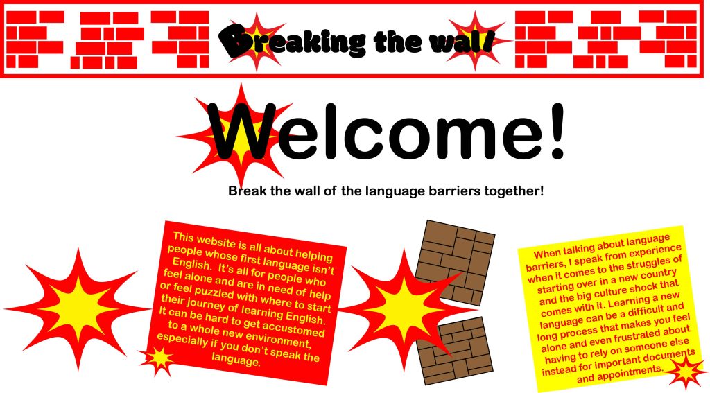
The first page is a welcome page, welcoming the viewers to the website. The welcome is the focal point because it’s the biggest sized text on the page which automatically guides the viewers eyes to it first. The two designs, one is of the explosion to represents destruction and the second one is of breaking the wall which is the whole idea of the project. For the two pieces of text, one explains what the website is about, whereas the other one is about my personal experience to make the viewers know the creator understands the problems from personal struggles.
Page 2
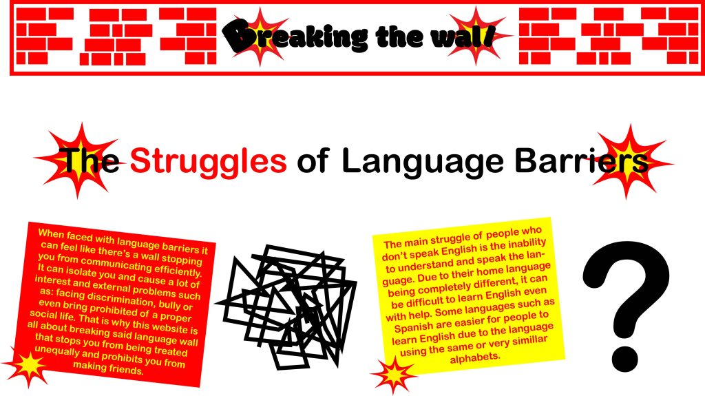
The second page is all about the struggles that language barriers can create. The ‘struggles’ in the subheading is in red to highlight what the page is about and make it very clear for the viewers. For the two designs, one is a question mark to represents the misunderstandings that can occur when people can’t communicate properly. The other design is of scribbles in a shape of a ball to represents the frustrations of not being able to convey what you want to say. The two pieces of text are all about how not being able to communicate affectively can affect people’s social, work and personal life.
Page 3
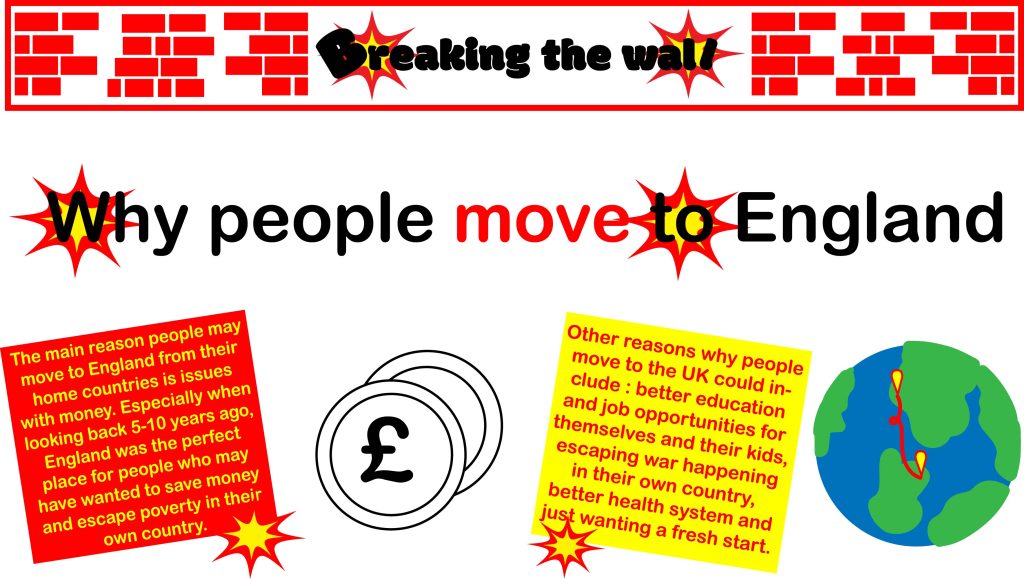
The third page is about the reasons people might come to England from their home countries. For the two designs, one is that of coins with the pound symbol in the middle to represents that the main reason for people to move is money. Whereas the second design is of the earth with two destination points to represent the moving from one country to another. One of the pieces of text is all about the reason of money that causes people to move. Whereas the second piece of text is about all the other reasons people may move such as: education, job opportunities, etc.
Page 4
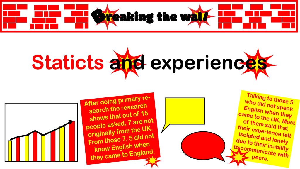
For the final page I talked with peers and friends to gather information to create primary research to use for the statics part of this page. One of the designs is of a graph to represent the different answers of the survey while the other design is of two different text bubbles to represent the different experiences people can share and talk about. For the text I used the answers from the survey to talk about figures in one of the text pieces. Whereas the second text piece is all about the different experiences of the different people that were asked for the survey.