Poster 1

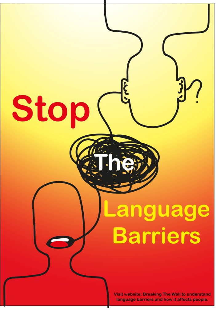
For my first advertising poster I wanted to use the idea of how it feels for people not speaking a language to hear that language being spoken. For that I used the brush tool to create two bodies and for one of the bodies I drew a mouth and for the other body ears. Then continuing to use the brush tool created a line from person A’s mouth to person B’s ears but halfway through made scribbles to represent how listening to a language that you don’t speak feels like. The line goes into the person B’s ear and comes out of the other ear as a question mark to show the confusion people feel. For the background the gradient tool was used and the two main colours red and yellow to create the background. For the text the opposite colours were used to make them pop out more from the background and at the bottom is a smaller sized text directing people to the website.
Poster 2

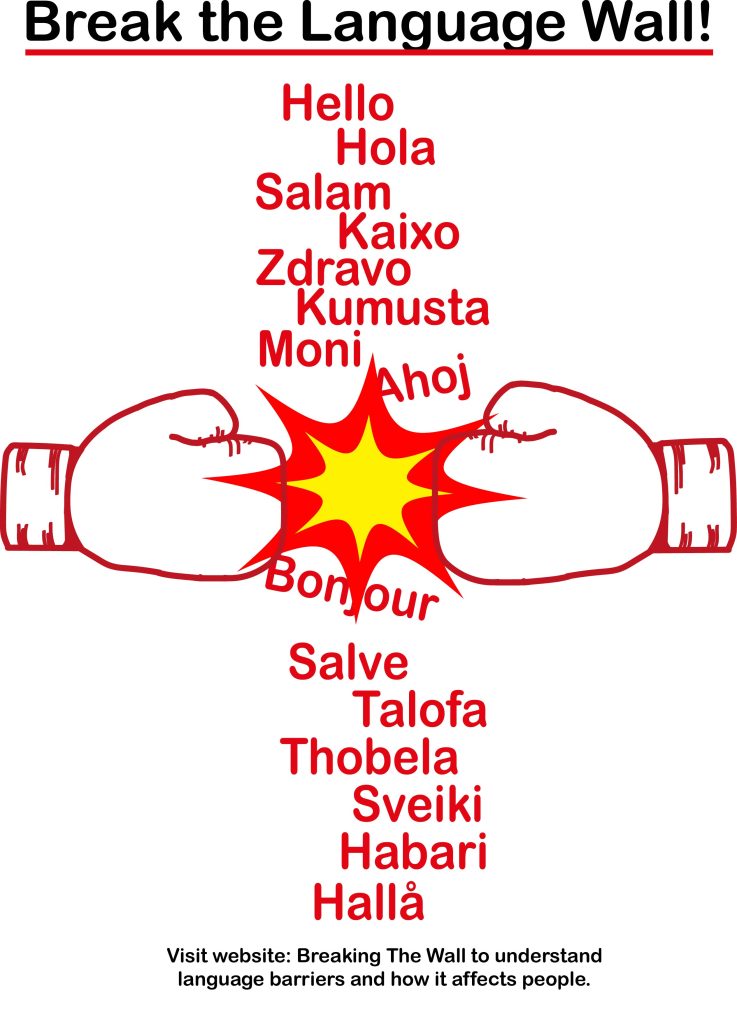
For the second advertising poster I used google translate to translate ‘hello’ in different languages. Afterwards, used all the different hellos to create a wall, then made boxing gloves (by looking at a real one that I had at home but just simplified it) with the brush tool and put the boxing gloves on each side of the wall. Using the explosion design to create the impression that the different language wall was getting broken by the boxing gloves. This poster is made to represent the message of breaking down that wall that stops people from communicating with each other. The background is plain white because of how busy the words and gloves look with the explosions. The name of the poster ‘break the language wall’ is at the top and in black to bring more attention to itself and like the first one this poster has directions to visit the website at the bottom in black.
Poster 3

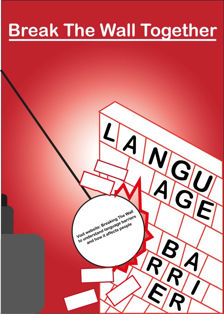
For the final third poster I used the pen tool to create a wall and then used the brush tool to create halfway cut rectangles. Then used the pen and circle tool to create a wrecking ball that is wrecking the wall. Inside the bricks of the wall, the sentence ‘language barrier’ is written. This poster represents the breaking of the language barrier wall by visiting the website that is written in the middle of the wrecking ball. For the background the gradient tool was used with different shades of red to create the ombre like look in the background that draws even more attention to the wall and wrecking ball. The colour of the wall is white to contrast the background. The name of the poster ‘break the wall together’ is also in white against the dark background to create more contrast.