Font Page
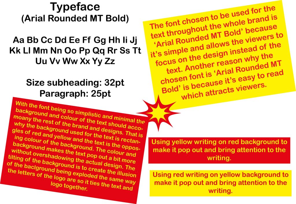
When deciding the font for the typographical graphic standards that will be used throughout the entire project I wanted to go for a simple and minimalistic type of typeface because then the viewers can focus more on the designs and purpose behind the project rather than on the text. The typeface that ended up being chose is ‘Arial Rounded MT Bold’ that is naturally bold as the name suggests. With the fact that the typeface itself is bold means that the text will still be noticed by the viewers, it just wouldn’t be the focal point. Using the colours red and yellow to continue on with the theme of the logo. Since the typeface is rather simple, I have used boxes behind the pieces of text throughout the project to make the text pop out more but not enough for it to be overshadowing the other aspects of the pages.
Colour Page
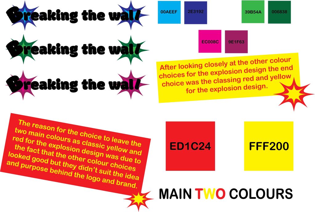
To find the two main colours that will be used in the typographical graphic standards as well as throughout the project I did different colour combinations with the logo such as green, pink, and blue to decide which colours will look the best for the logo and the whole project. However, after looking at the more colourful options, at the end the decision was to keep the colours of the explosions more classic red and yellow. I did not want to use more then two colours for the typographical standards because I did not want to make the pages feel busy by having too many colours going on at the same time. That is why red and yellow and different hues and saturations are used throughout the project.
Logo Page
The logo page for the typographical graphic standards is all about how the logo could look like throughout the project. For my logo typographical standard page, I have showed different backgrounds options that have potential to show up in designs and pages later on. The first background is of a brick wall that is hanged by strings, this design is to represent the ‘wall’ in the logo. The second background is of explosions designs that are set at the back of the letters to represent the ‘breaking’ in the logo. The third background is of a yellow box behind the logo which is to bring more attention to the logo and make it more noticeable to the viewers. Then the logo was tried in a stacked and horizontal formation. At the end the horizontal formation was preferred since the stacked one looked too busy from all the different words stacked on top of one another.