To start the website design process the first step was to decide where the logo will go, at the end the logo will be positioned on the top left of the page because it catches the users eyes but it’s not the focal point.
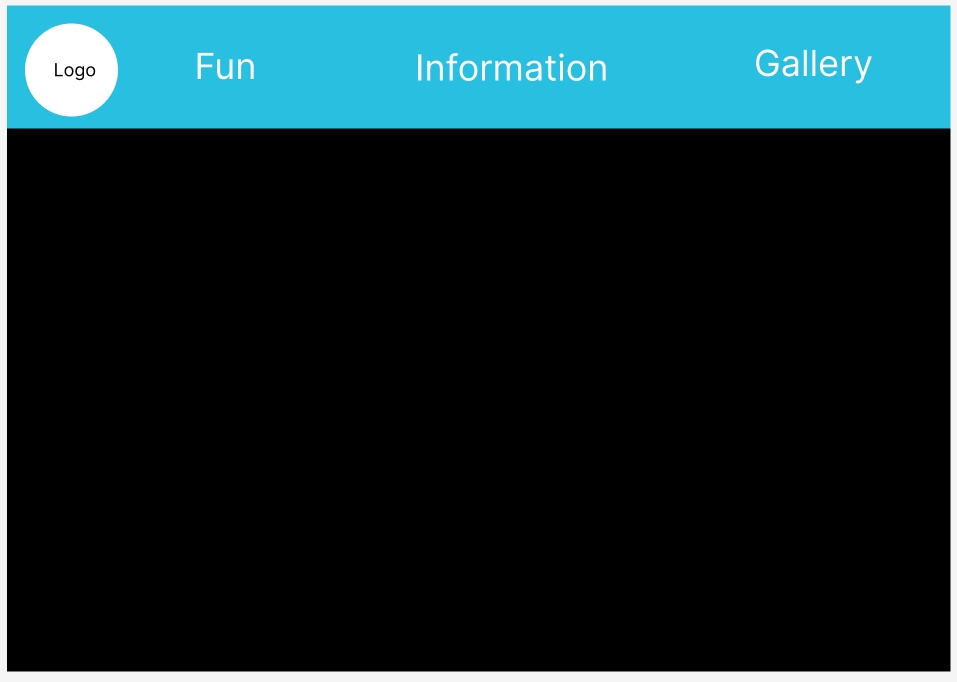
After choosing where the logo will go the next step was to decide how to design the different categories and menus that will go take the users to the desired information. The three different menus are: fun, information and gallery. The reason those three are chosen menus is because they are the most important information the users will be interested in (when looking at different festival websites the main menus that they have used are these.) The background of the menus along with the logo, the whole top of the website is in a different colour to add more contrast to the black background and make the menus and logo more noticeable.
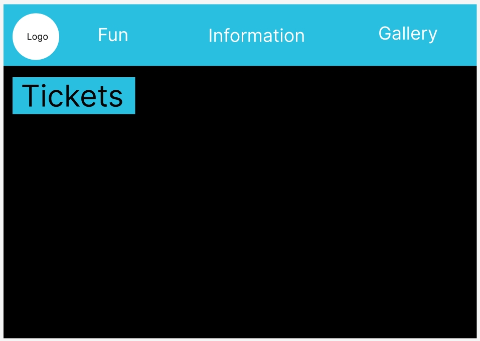
When thinking about the ticket menu, looking at the survey answers from the app design, the users feedback highlighted how the tickets being it’s own separate button that will immediately bring the users to the tickets being menu was very liked. Due to that reason the tickets are not in the top menu bar but it’s in an own button that is under the menu bar.
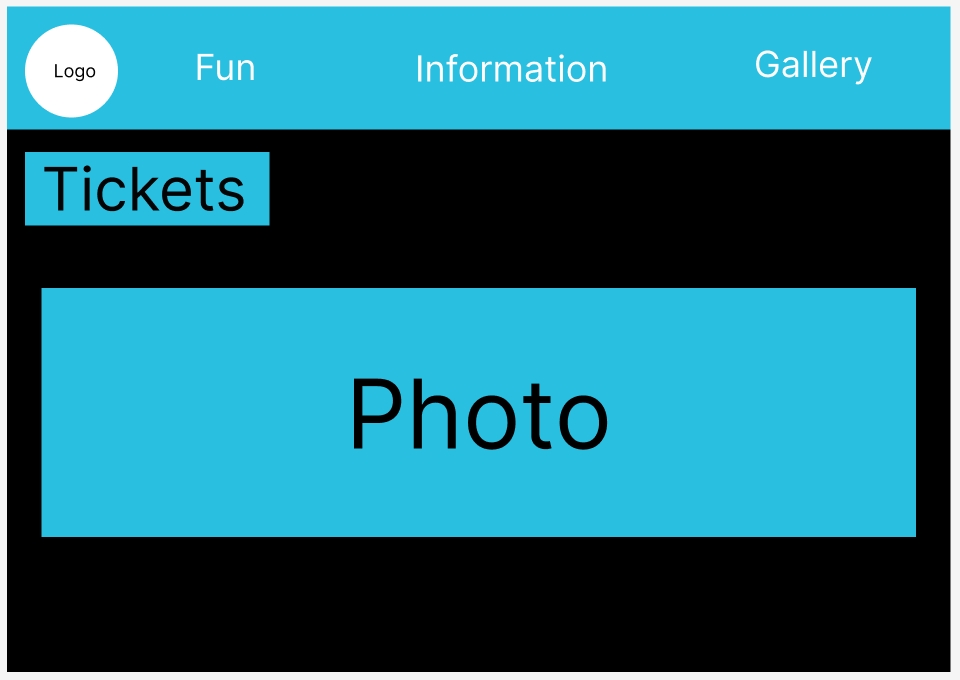
Like the app design there needed to be an image that will be the focal point of the website, the photo is in the centre of the website since it’s the biggest component of the whole design and that will naturally bring become the focal point that the users will see first.
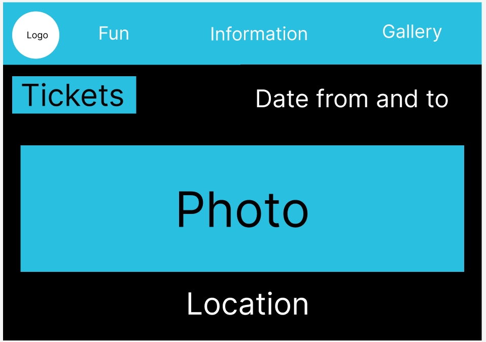
Finally, the date is at the top right under the menu and will be in the white lettering to not get lost in the background, unlike all the other components the date and location are not in a blue box because then the whole website will look busy for the users eyes, and it will become too much to look at which can put off users from continuing to look at the website.
Like the app after the website design was finished, it was put on reddit to gather feedback from users. The feedback was again mostly positive, some of the answers appreciated the continuity of the designs colours, style and overall vibe of the two designs.
Figma link for the website design development: Website Design – Figma