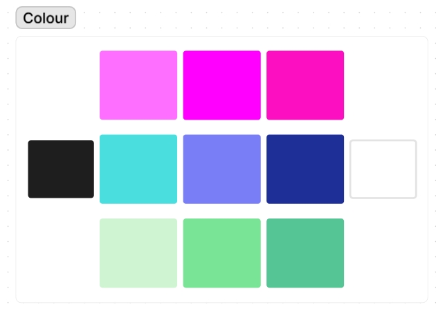
To help me decide on the colour palette for the future layouts and overall design, I created a colour mood board that has three different hues/shades of blue, green and pink. The reason these three colours were specifically chosen was because their shades are both vibrant and contrast well with the black background of the website. The black and white at the side are because black and white are used no matter what, black for the overall background whereas the white is used for the typography to create more contrast against the background. When using these colours in the Figma/FigJam design the name of the colour will be put in the colour wheel to make sure that the colours are exactly the same as the mood board.
The next mood board is all about the logo and the different variations of it. The logo was created by me and it’s circle with sparkles around it with the name of the festival inside the circle. The reason for the sparkles are because it makes people think of magic which is connected to fantasy. the original logo used a white background in the circle with black lettering and a black outline around the circle, the sparkles are traditional yellow with darker yellow outlines. In the mood board the logo has been changed to demonstrate how it will look on black background that the website is in. The outline colour has been changed along the sparkle outline and lettering colours. All of the variations are to bring more attention to the logo and to make it pop out more to the users, since if the users remember the logo it will help the festival to be more recognizable which helps attract more users to the website.
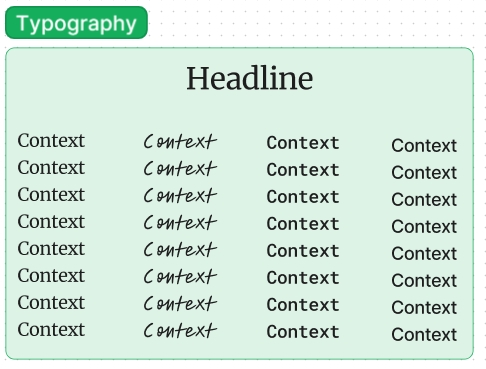
The final mood board is all about the typography that will be used in the design of the website. The fonts are used from Figma, the different fonts allow us to see how the text would look like, the four fonts used are: simple, bookish, technical and scribbled. When looking at the future designs the font that will be used primarily will be simple or technical. That is because if a more unique and scribbled font is used it will become hard for the users to be able to read the information on the website. With the fonts being more simple and understandable it will make sure the website doesn’t feel too busy for the users to the point they would want to click off from being too overwhelmed.
Figma link for the moodboards: Moodboards – FigJam (figma.com)