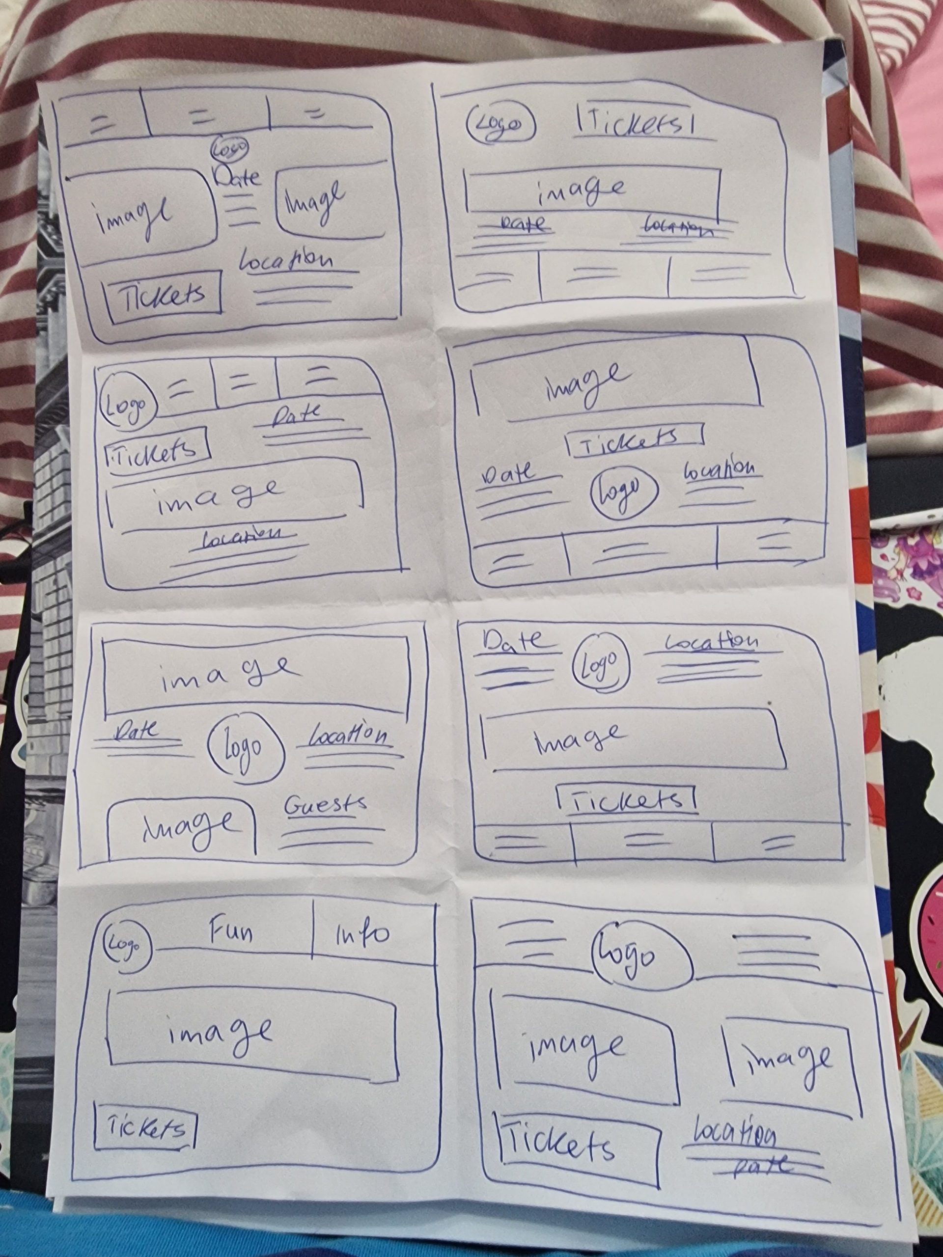
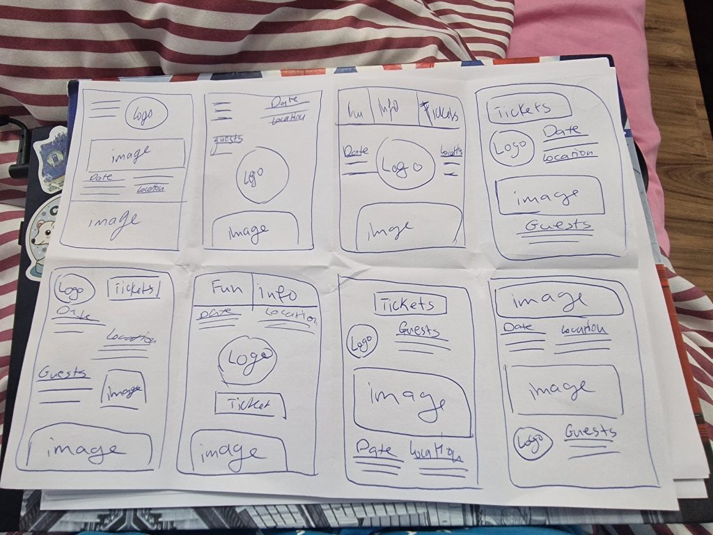
When doing the mid fidelity layouts the first step was to make 8 different small sketches to help when going into the design file to know what layouts to try out. When doing the sketches the paper was folded 8 times and a minute was used for each sketch so they are simple and quick.
After finishing the website sketches I went into the design file into Figma and started creating three different layouts that are of the three different main menus that the users can access from the main website page.
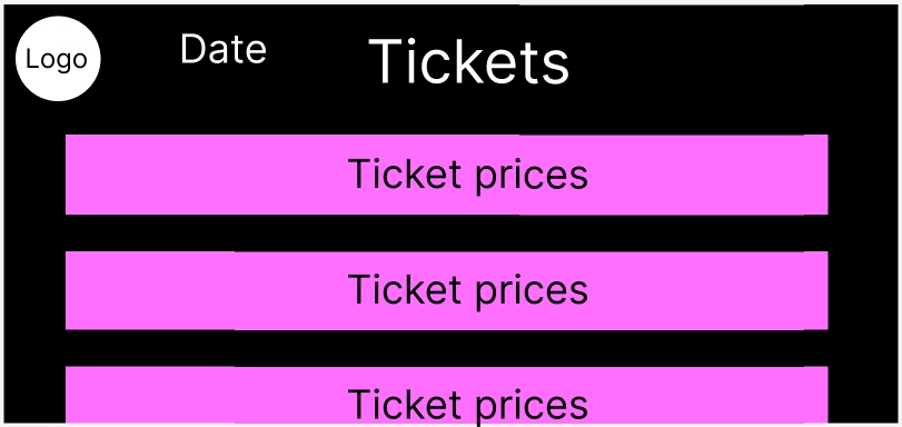
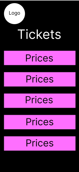
The first menu is of the tickets, the headline of the layout is on the top and on the left is the logo and the date of the festival. Under the headline there are sections that will have different ticket prices for different ages and also discounts on prices for larger groups coming. This way the users can know exactly how much to pay, the more they scroll the more different prices and tickets will show up since not all the prices can fit on the website screen which will engage the users more.
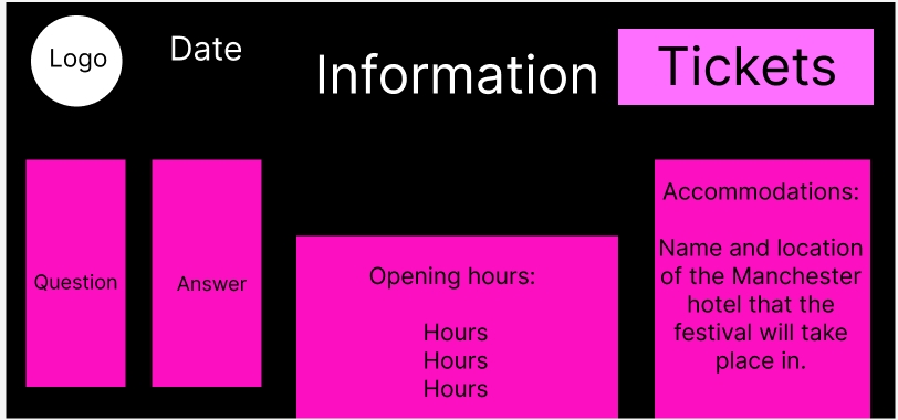
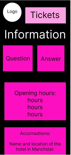
The second menu is the information, next to the headline on the left is the same logo and date but on the right side there is the tickets button that will immediately take the users to the tickets menu. On the information screen it’s all about the accommodation, opening hours and Q&A section that will give out more in depth information for the users that will also help answers frequently asked questions.
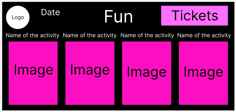
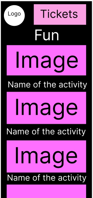
The final menu is the fun, the same way as the information menu the date and logo are on the left and the tickers are on the right. On this menu there is an image of the different activities that will take place in the festival and the name of said activity on top of the image that will help users see what to expect at the festival.
For the app design it started with the 8 sketches a minute as well to help with the layout again the same way with the website.
For the app all the menus and information under the menus are the same but since the app is on a smaller screen when the website the users will have to scroll down more for the information, like the fun menu the images are a bit smaller to fit on the screen but also the users will have to scroll down a lot more to be able to see more. This will engage the users a lot more which can peak their interest a lot more then with the website.