When choosing the colour scheme and typography for the future design and layouts I went into FigJam and took the website design layout from the start and tried different colours and fonts three times using all of the research and surveys done throughout this time. The colours are taken from the mood boards and the layout is the most liked from the reddit survey done where users said this layout is the easiest to navigate and understand.
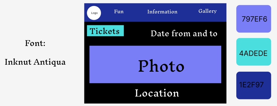
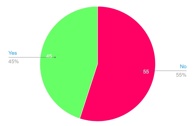
The first choice is an all blue colour scheme with a more elegant looking font. The colours used are at the side with their names inside the colour boxes and the font is on the left to help make it easier to find for future designs. After doing the blue layout there was another reddit survey to help see what the users think of the blue theme. The results are visually portraited in the pie chart below.
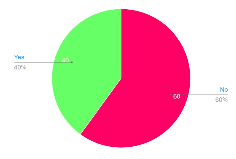
As it’s showed most of the survey answers didn’t like the blue theme due to the font saying that the font doesn’t fit in with the overall feel of the website and so the blue theme is not very well liked from the users due to the font used for the typography.
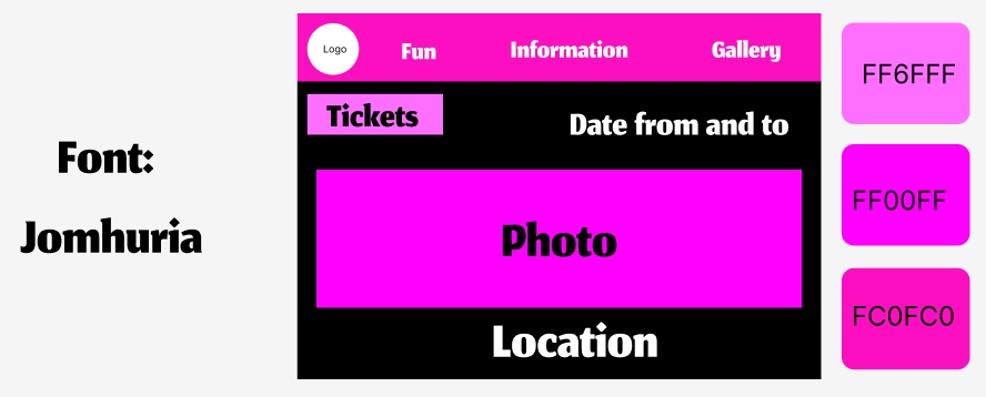
For the next choice the colour scheme is pink with a more bold font to make it pop out more. Listening in to the survey answers the font has been changed to a more bold one that will be easier to see and read better. To check if this idea is better then the blue themed one, another survey has been done but for the pink theme to see if the users prefer this font over the other one and if the colour is better liked. These are the answers of that survey.
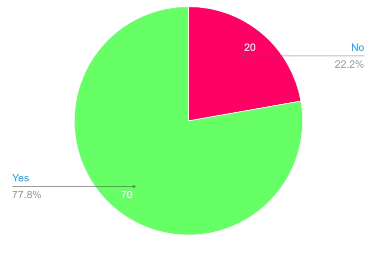
As it’s shown a lot more users preferred the second theme layout more, with the pink colour scheme and more bold font. Some of the answers said that the font and colour compliment each other and it made the users more interested and it makes it easier to read and understand.
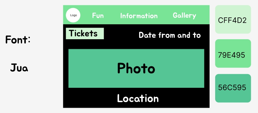
The final layout is using green colour scheme with a more simple, bubbly like font that makes the design feel more simple then the other two. The green colour scheme makes it more bright and vibrant then the other designs. After the design is done like the other two there is a survey put out on reddit to see what the users think and these are the result from it.
It’s clear that the users don’t like this design as much as the pink one and some of the answers for this reason are that the green doesn’t suit the vibe of the festival as much and it makes the website feel a bit overwhelming.