When deciding the design laws that will apply to the final design, the feedback from users is of great importance to make sure that the design for the website and app are going to be well received from the users. For example, from the conducted research we know that users prefer more subtle complementing colours such as white/black and another colour (blue, red, purple, etc.) to add contrast, and due to the fact that it makes it easier for the users to navigate through a website without getting overwhelmed by bold colours.
From the feedback given tickets, information and fun will be the three main menus. Under tickets will be the ticket prices and packages, under information will be the accommodation, FAQ’s and opening hours, and under fun will be highlights and timetable and a map. This is all in response to the feedback we got from user’s surveys.
The design, colours, menus and information under the menus will all be the same across the app and website, that way the festival will be easily recognized from users when they come past an advert. The consistency of the designs will be instantly recognizable. The users make for most of the stakeholders, this festival will not be sponsored by anyone and will be independent faction, this allows for the aesthetic and design of the website and app to be solely focused onto pleasing the users.
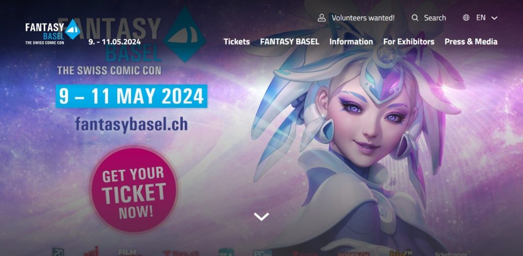
This layout example from Fantasy Basel, is the opposite way of the design this festival will use, this festival will focus on simplicity and not using busy images and make sure there isn’t an overload of information.
Fantasy Basel found at: Fantasy Basel (accessed 09/03/2024)