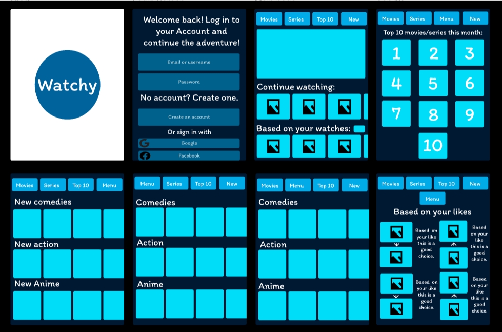
To develop the app to a tablet version the starting and log in page as well as the main landing page had to be enlarged to fit into the tablet screen. The positioning of the top 10 movies/series of this month was changed around to fit all ten of them in one page so the user doesn’t have to scroll down to see all of the images. The images on all of the pages have also enlarged as well as the text, this will make it easier for the elderly and vision impaired users that may have worse vision due to age or medical reasons to watch their movies/series easier since the images and texts are enlarged.
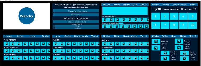
For the website version of the app (which is the biggest version) once again the text and images have been enlarged to fit to the size better. However, not only that but the continue to watch, based on watches, movies and series all have more recommendations added into them for the users. The top 10 series/movies are also moved in position once again to have all 10 in the same page. The main difference with the website from the app and tablet is the header, in the app and tablet the sections are into separate individual boxes the users can press whereas, in the website version there is a line at the top that has all of the sections that the user can click all through out the pages. This gives the prototype of the website a more clean and finished look.
Figma link for the tablet: Tablet – Figma
Figma link for the website: Website – Figma