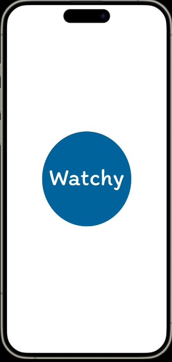
The first page that the users will see when entering the app would be of the name of the streaming app that they click onto and then it brings the users to the log in page. The reason for the blue colour scheme is that the users will notice through out the whole app is because I wanted to focus on a singular colour pallet to not only make it more simple but to also create a connection between one colour and the streaming app.
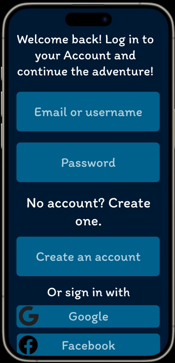
When the users click onto the circle, the next page to appear is the log in screen that will ask the users to enter their email and password or create an account. The background is in the darkest blue of the colour pallet chosen so that it creates contrast with the lighter blue in the front and with the white text, making the text pop our more and bring the attention to the text.
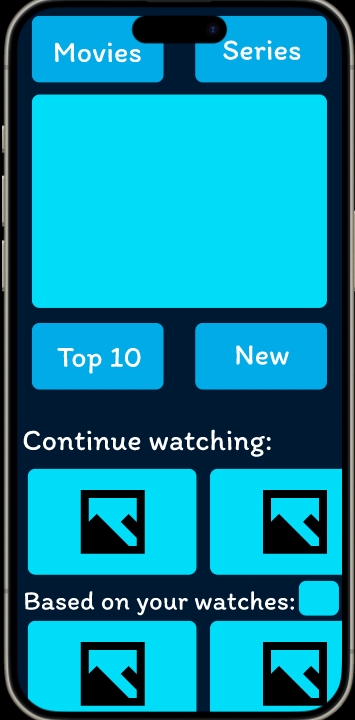
When logged in the user sees the main landing page, this page has four categories the user can choose from, with a photo of a trending movie/series in the centre. Underneath is a continue to watch and based on your watches recommendations that is the two most important things to add based on competitors research and questions answered from classmates and friends. The user can click whichever of all the categories and the blue box next to the based watches that will take the users to different pages.
Overall, the design of the app is centered around the idea of being simple and not overwhelming the users with too many colours, pictures or tabs on top. That is why the tabs are not a lot and why there is one colour pallet.
Figma link: App – Figma