All the banners were made using Adobe Illustrator, with the brand colours that have been used so far throughout the whole design. The text is in the font ‘Comic Sans MC’ like the website, this is all for continuity and making the brand more recognizable.
Wide Skyscraper
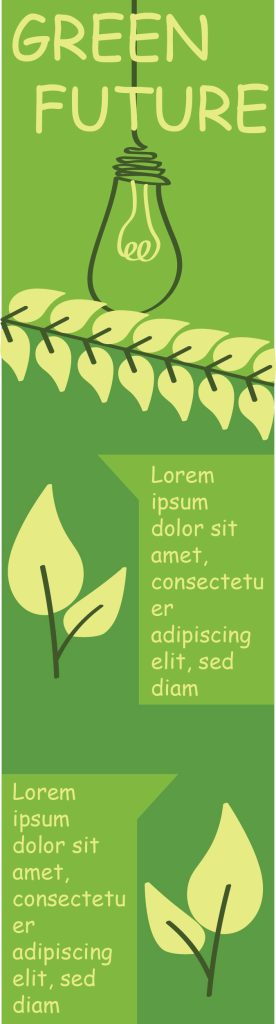
The first banner is the wide skyscraper dimensions, this one is long and narrow so at the top there is a hanging light bulb that has the company’s name at the top in light green. Using the draw tool in Illustrator to create the light bulb and the leaves that are lower on the banner, next to the leaves there are rectangles that have a pointed edge at the side that was made using the pen tool, this is where the text goes in. With this banner being so long there is a cut at the top where it goes from light green to dark green to create contrast, with a roll of leaves cutting the transaction of the colours off. This banner focuses more on design rather than text so that the customers don’t get overwhelmed with too much text.
Mobile Banner
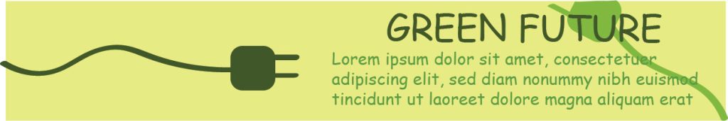
Moving onto the second banner which is the mobile dimensions. Since the last banner was more focused on the environmental side of the company, this banner goes back to the root of the company which is to provide energy. That is why once again using the drawing and pen tool there is a cable charger coming from the side that goes to half way through the banner as well as another one going through the text, to remind the users the company is all about energy as well as being eco-friendly. This banner also isn’t heavily based on text since the dimensions don’t allow for a lot of text or the design will feel way too busy.
Rectangle
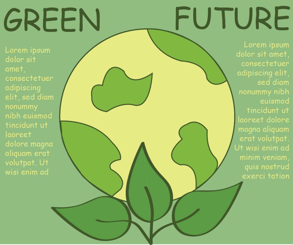
The final banner is the rectangle dimensions banner, since this banner is more proportional dimensions there is a fair amount of text to design ratio. Using the drawing and shape tool to create the Earth in the middle and add leaves coming from the bottom shows that the company aims to help make the planet a better place with being environmentally friendly. Since these dimensions are more proportional there’s more text on both sides of the Earth, with the design being quite big it allows there to be a lot of text without overpowering the message of the banner.