Sketches
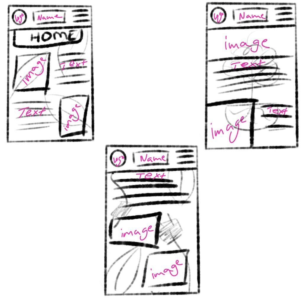
For the wireframe prototyping I chose the app design, using the iPhone 14 protype in Figma (390×844) as the screen dimensions. To start it off I used Procreate once again to draw the sketches, since there will be two examples of the prototypes there are three sketches to give me some choices, all three sketches try out different compositions and background pattern but the logo position along with the name of the company and hamburger menu all stay the same.
Rough Examples
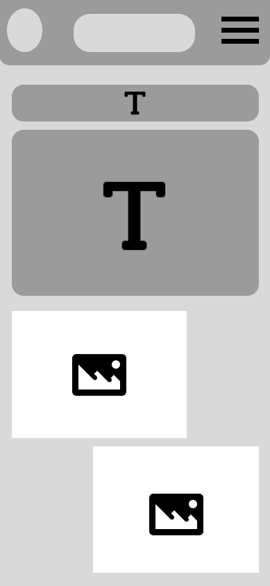
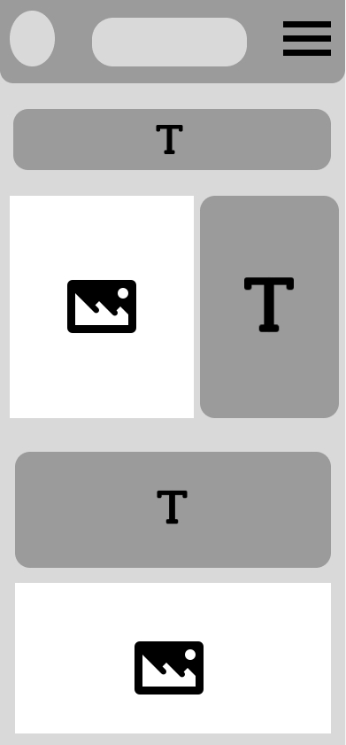
Moving on to the two rough examples, these are without colour or text, instead there are squares to block out and visualize how the composition and layout of the app would look for the later stages of the prototypes. Following through with the sketches there are two different layout ideas. The one on the right is more text heavy with three different text sections where the text will be about introducing the company and what it stands for, where it’s aiming to go for in the future and how it is helping the environment. Not wanting to overwhelm users with too much text information there are image aspects of the layout that will allow for the user’s eyes to not get overwhelmed by the amount of text. The second rough example on the left has the same amount of images in it but the text piece is all together in one bulk in the middle rather than separated in different sections, this is so when the users see a big text their eyes will immediately notice the imagery underneath which will help seem like it’s not as busy.
HQ Examples
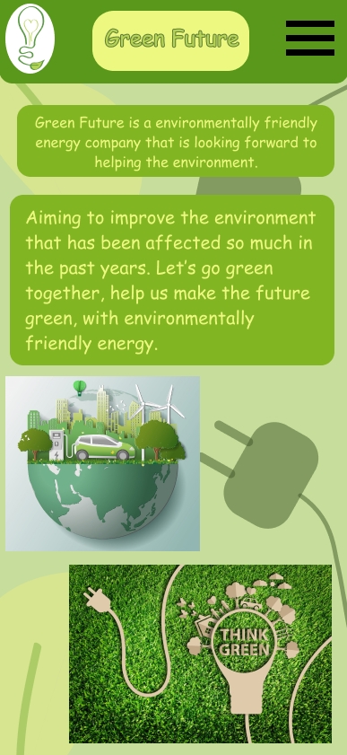
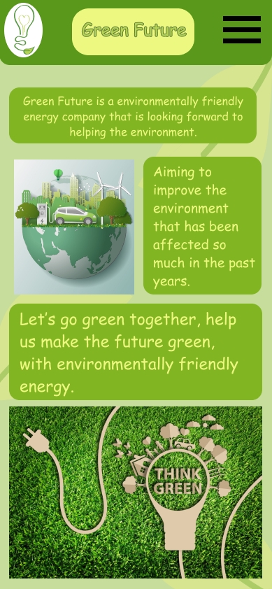
The next stage of the prototyping was to create two HQ examples, these are not high fidelity which means they are not responsive to user input. In this stage the imagery, text and colours are added. This is what the final app would look like, but the final one will be responsive. This is the welcome page of the app the first page the users see. It follows the brand colours and the rough examples compositions. At the top the chosen logo is on the left, the company name in the middle and the hamburger on the right. The background patterns were made and imported from Adobe Illustrator, they add a more visual aspect to the design as well as the imagery (1 & 2). The top text tells the users what the company is about, and the text explains what the company aims to do, using the same colour pallets through the designs helps with creating a consistent and recognizable brand image.
1 – 5 Ways To Shift To Green Energy At Home found at: 5 Ways To Shift To Green Energy At Home – Blue and Green Tomorrow [Accessed 07 January 2025.]
2 – Green renewable energy ecology technology power saving environmentally friendly concepts, electric car at charging station beautiful park city background on globe found at: Green renewable energy ecology technology power saving environmentally friendly concepts, electric car at charging station beautiful park city background on globe – REMI Network [Accessed 07 January 2025.]
Figma file: https://www.figma.com/design/ak3qcd0bEECIPoEoXh4gye/App-Layout?node-id=0-1&t=jC33Rl0sGqwWeMGP-1