For the final step of the process, it was time to add all the text and images, with the feedback from the users into account to make the high-fidelity prototype for the three screens. Using the OSHI website to guide me with the text that needs to be put in place of the filler text that was used in the mid-fidelity prototype (6). The overall things that have changed to all three of the screens are the background capacity colour, making it lighter to make it easier for users to read the text, as well as adding a low white capacity circle behind the logo to make it pop out more and not get lost in the boarder.
Desktop:
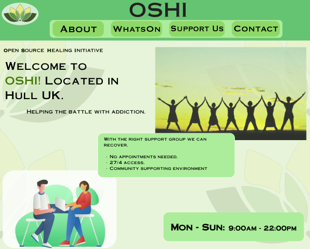
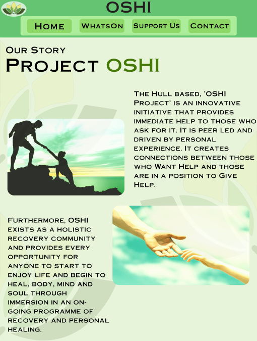
For the Desktop screen the buttons inside the boarder are highlighted more by adding another lighter boarder behind the buttons and then circling each button with its own little boarder that is of darker shade so that it helps users see the buttons easier and differentiate them easier. When doing the desktop home screen, I did not stick to the mid-fidelity layouts, instead taking inspiration from OSHI’s current website and using their composition of adding text in a bubble of sorts that slightly overlaps the image, when doing the welcome text the OSHI is highlighted with a green shade to help make the name more recognizable to users since the pop of green in the otherwise black text immediately catches the users eye. Keeping with the theme of green, all the images used have been altered in photoshop to have a green tint to them so that there are no clashing colours that will annoy the users’ eyes when looking at the website. The days which OSHI are open are at the bottom along with the hours with bold letters to make it more visible and to catch the users’ attention since this is important information for the users to know.
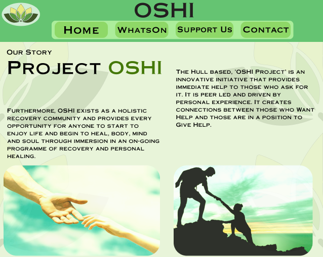
With the next step being making the website responsive the users will be able to press on the ‘about’ button and they will be taken to this page which is all about how OSHI came to be and their story. This page does use one of the layouts made in the mid-fidelity with two images at the bottom and text on top, like the welcome page, this one also has highlighted OSHI in green to make it stand out for the users, with the title being the biggest size in text it immediately tells the users what the page is about. There is some space in between the texts to make sure there is enough white space to not overwhelm the user with mountains of text and like was suggested before all the text reads from left to right now instead of in the middle like before.
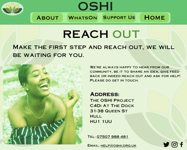
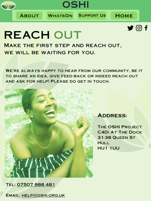
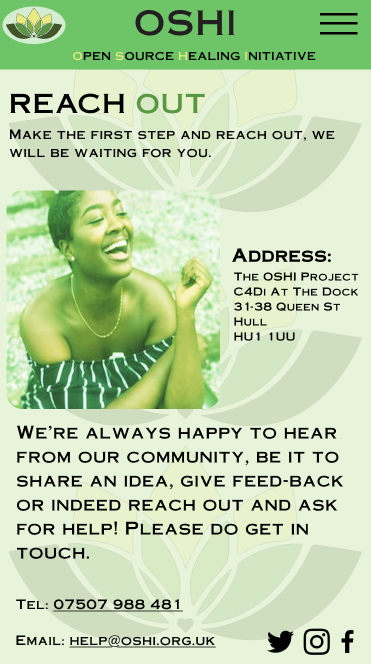
The final page is to help users ‘contact’ OSHI, with the same idea of highlighting a part of the title in green to help it stand out but this time there is no OSHI but instead the ‘out’ is highlighted in green to help encourage users to seek help if they decide to. For this page I have taken OSHI’s address from their website and have made the text for it big and bold so that it stands out even more, with their telephone number and email address below, the users can press on the email, and it will send them to OSHI’s email to get their desired help. This layout is not in the mid-fidelity, but the composition helps the page look tidier without being busy or overwhelming for the users.
iPad:
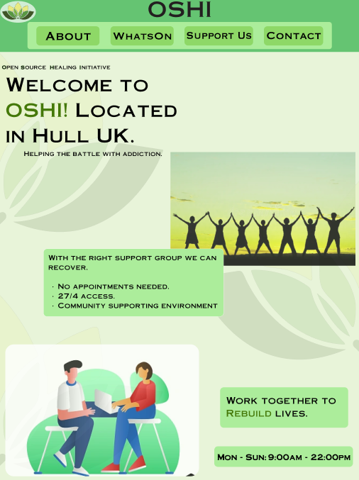
Moving onto the iPad screen, the home page follows the same composition and layout as the desktop one, with two images, a welcome title and text in the bubble that overlaps with the image. However, due to the iPad being larger in both width and height there was too much white space left on the page that made it feel empty, because of that the extra ‘work together to rebuild lives’ text bubble at the bottom above the hours and days was added so that it helps not only fill the white space but also to remind users of what OSHI is striding to achieve with their campaign to help rebuild people’s lives, the ‘rebuild’ part of the text being highlighted in green to further emphases that point across.
For the ‘about’ page the layout has changed from the desktop screen, instead of having the two images at the bottom of the page there are now next to the pieces of text, this is to help utilize the space of the iPad dimensions the best way, with the hierarchy of the text going down with the help of the images it guides the users eyes easier to what to read first and then second. The images are not in the middle of each of the texts, instead they are closer to one another to help with keeping white space and from preventing the users getting overwhelmed.
The ‘contact’ page is a very similar layout to the desktop one, but the title has been pushed to the left side to one make space for the socials icons without getting squashed and it keeps consistency with all the other titles on the pages being on the left side of the page. Due to the wider space the image is enlarged, and the address is also in a bigger text size with the encourage text on top, leaving enough white space for the address to be read without feeling busy or overwhelming.
Mobile:
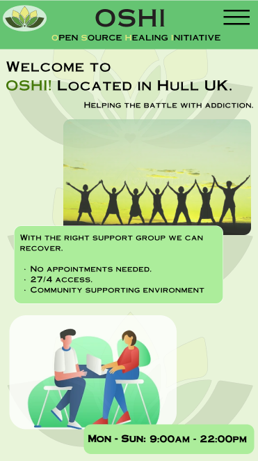
Finally, moving to the mobile screen, there is the hamburger menu that means the official name for OSHI is under the name in the boarder without a bubble but instead the first letters that spell out OSHI are highlighted in light green that makes them be more visible and brings the users attention to them. The home page follows the same layout and spacing as the desktop and iPad versions.
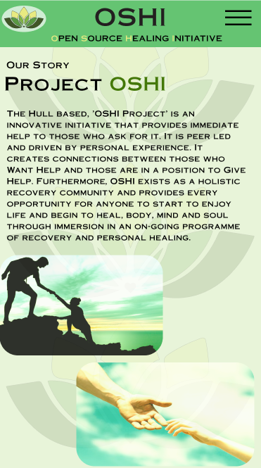
The ‘about’ page (that the users will be able to go to when pressing on the hamburger menu and the menu will come down letting users choose the page) doesn’t follow any of the layouts from before, instead of having the text apart in this screen the text is all together with the images at the bottom, this composition does mean that the users have to read a chunk of text which they didn’t have to before but it makes the website look more classic.
The ‘contact’ page does follow the layout of having the image on the left but this time the encouraging text is in the bottom instead of at the top, the address is in the same space as before with the telephone and email at the bottom with the icons, this composition ensures there’s still white space but the message of encouragement isn’t lost to the users.
1 – Freedom found at: Stock Photos & Images, Vectors, Video & Audio – Dreamstime [Accessed 08 Dec 2024.]
2 – Character illustration- Counselling found at: https://dribbble.com/shots/9072301-Character-illustration-Counselling [Accessed 08 Dec 2024.]
3 – Giving a helping hand. Lending a helping hand found at: https://www.freepik.com/premium-photo/giving-helping-hand-lending-helping-hand-hands-man-woman-reaching-each-other-support-hands-man-woman-blue-sky-background_19976193.htm [Accessed 08 Dec 2024.]
4 – 5 Bible Stories About Helping Others found at: https://www.orbcfamily.org/blog/christian-living/5-bible-stories-about-helping-others/ [Accessed 08 Dec 2024.]
5 – New Study Suggests Smiling Influences How You See the World found at: https://www.psychologytoday.com/gb/blog/the-right-mindset/202008/new-study-suggests-smiling-influences-how-you-see-the-world [Accessed 08 Dec 2024.]
6 – OSHI (2024) Website. OSHI – The Open Source Healing Initiative in HULL UK. [Accessed 08 Dec 2024.]