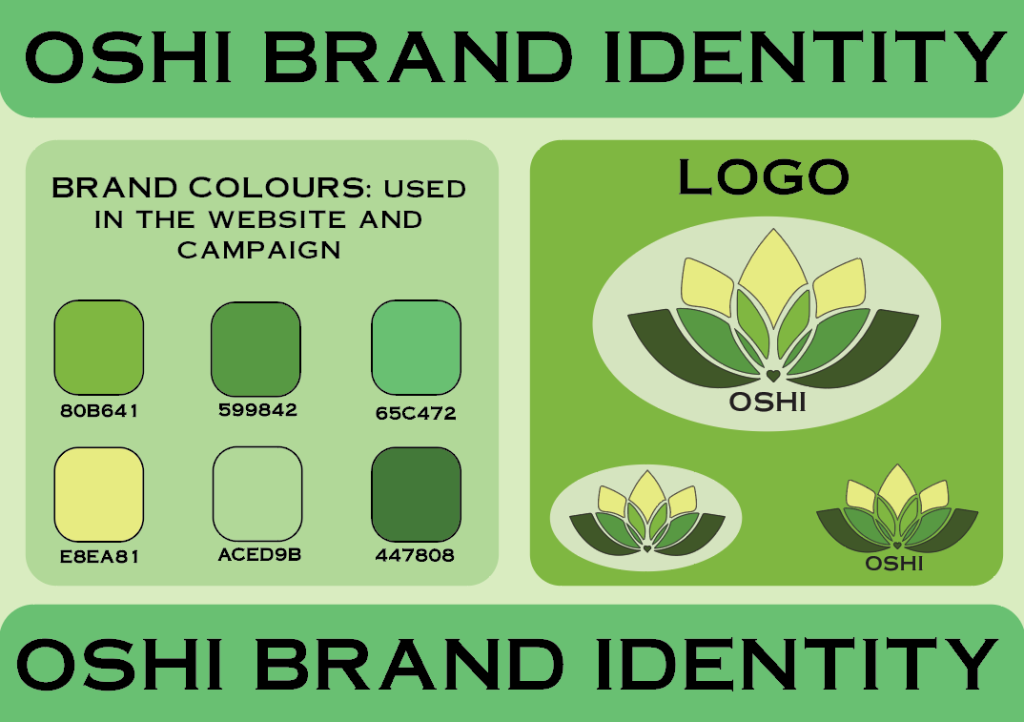
The brand identity guidelines are used to help guide the team through the brand colours and logo. To create the guidelines, I have used the colours previously used in the website that help build the visual aspect of the website and campaign. Throughout the whole campaign and website these colours are used to create a consistent and recognizable visual impact, said colours are in a rectangular shape with the name of each of the colours below it to make it easier to find the needed colour. Next to the brand colours there are three variations of the OSHI logo, throughout the whole website and campaign these three variations can be seen used, the main one being the one with no typography and with white circle as the background to help the logo pop out more against the green background. With these brand guidelines the OSHI colour scheme and style of typography, ‘Copperplate’, has been kept to once again create continuity.
Moving onto the campaign that includes e-commerce, an Instagram post and Facebook post, this focuses on advertising and getting the word of OSHI and our cause out there.
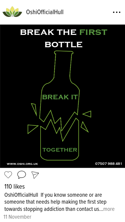
To start with the Instagram post I looked at how Instagram does their layouts (1), to help me with placing of information and choose the font of the typography. Below the likes of the post there is a little description of what the actual post is about as well as the date. For the actual post I used Adobe Illustrator to create an outline of a broken bottle and shards using the pen tool, then exported it and imported it in Adobe Express, adding the typography using once again the signature font ‘Copperplate’, using the brand colours to change the outline and some of the words to continue the consistency of using the brand colours throughout even the social media aspect of the campaign. This post focuses on breaking the bad habits of addiction to alcohol. Adding typography to the inside of the broken bottle helps guide the users’ eyes to the message of the whole post, the bold white text at the top helps creates a contrast against the black background. Not wanting to overwhelm the users’ eyes with too much text is the reason the text inside the bottle is in the same colours as the outline of the bottle. Furthermore, the word ‘first’ is in green to help bring attention to the message behind it.
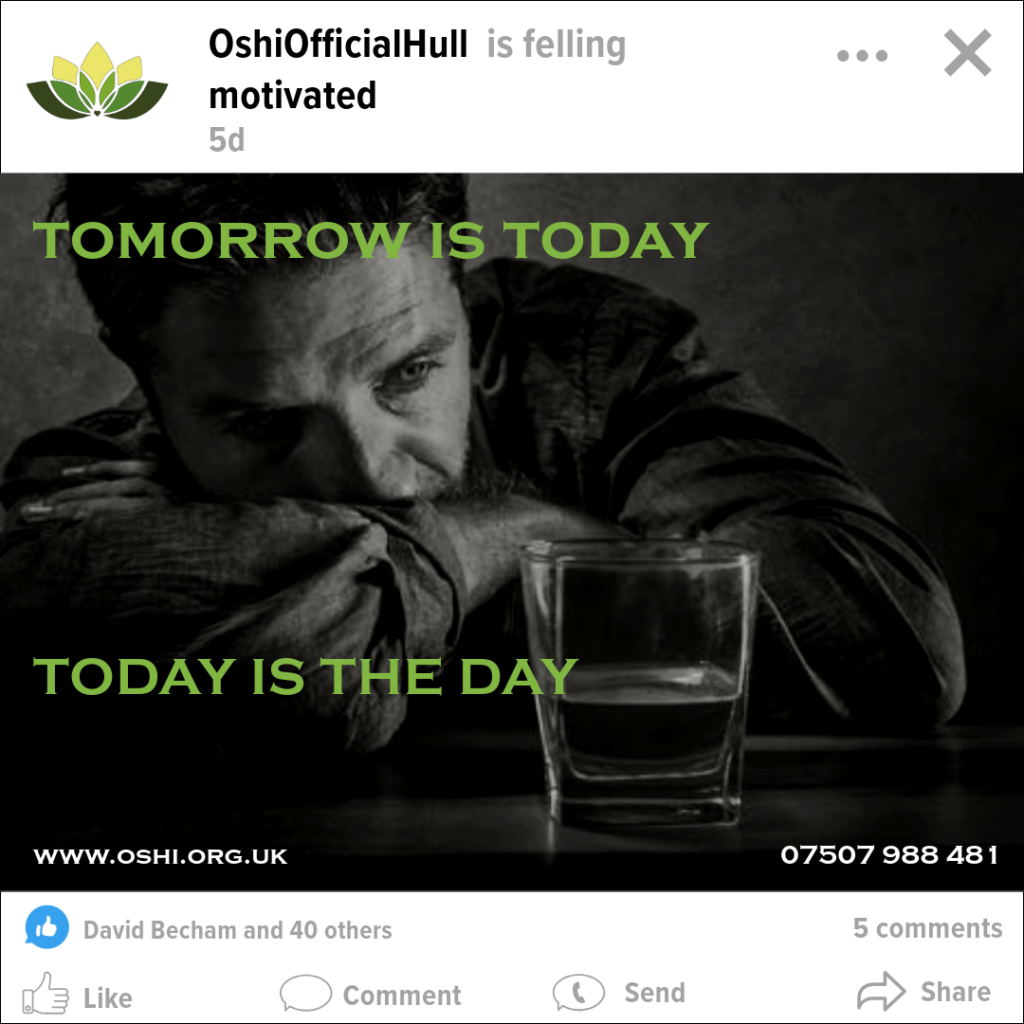
Continuing with the social media platform posts, similarly to the Instagram post, the same way I looked at a Facebook post layout (2) to help with the composition of the post and the placement of elements such as ‘like’, ‘comment’, etc. For the actual post itself, I found an online image (3) to use as background. With this image imported into Adobe Express I opened the ‘effects’ panel of the photo that shows when you press on the image, from there I changed the basic effect to grayscale, then I went to ‘edit’ and ‘adjustments’ and changed the brightness to –19, highlights and shadows to –100. This way the image is darker but still visual and easy to see and understand from the user’s point of view and the text on top is still visible. Similarly, to the Instagram post the typography is green to emphasize the message the post is trying to convey to users.
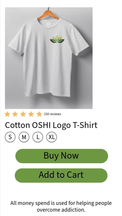
After finishing with the social media posts, the next step was to create an e-commerce page that will showcase what a selling website will look like for OSHI, with the fact that this organization is a non-profit one in mind there is a disclaimer at the bottom of the page that informs users that any purchased made the money used will be used for helping people overcome addiction rather than OSHI benefiting like how a profit focused organization would. The e-commerce page was made once again using Adobe Express, using visual elements and typography to create the reviews, the sizes, and once again following the brand colours the ‘buy now’ and ‘add to cart’ buttons. For the mock-up an online mock-up of a hanging t-shirt was used (4) and opened in Adobe Photoshop where the re-designed OSHI logo was imported and positioned on the left side of shirt.
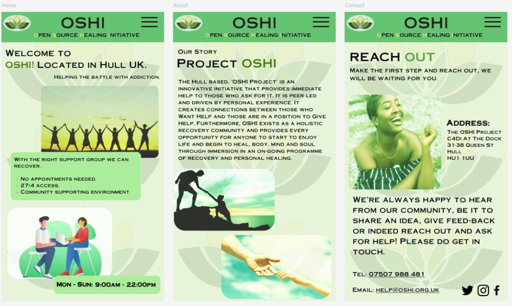
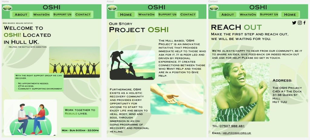
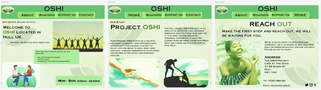
Following through with the Development Log the website with the three dimensions for iPad, Desktop and Mobile were made responsive in the portfolio. The narrated video showcases how the responsiveness works for all three.
For the Desktop and iPad versions both take the users to the correct page when the corresponding button is pressed, for example when a user clicks on the ‘Contact’ button the website takes the users to said page and it’s the same for ‘home’ and ‘about’.
With the Mobile version its different since the header for this version does not have the buttons in it which means that for this version there had to be a hamburger menu made that will pop down for the users when it’s clicked an it will showcases the buttons that way. This has allowed me to use the full name of OSHI – ‘Open Source Healing Initiative’ under the OSHI name in the header instead of the buttons and this is the only version that has that due to that free space in the header, highlighting the first words to form OSHI.
1 – Instagram post template with notifications found at: Free Vector | Instagram post template with notifications [Accessed 03 January 2025.]
2 – FREE Facebook PSD Post Mockup – 2018 found at: FREE Facebook PSD Post Mockup – 2018 :: Behance [Accessed 03 January 2025.]
3 – Stopping Drinking In January Is Easier Than You’d Think found at: Stopping Drinking In January Is Easier Than You’d Think | by Domingo Cullen | Medium [Accessed 28 December 2024.]
4 – T-Shirt on Wooden Hanger Mockup found at: You searched for t-shirt – Mockup World [Accessed 04 January 2025/]
Narrated Video