From the four available topics that were given as a choice, the energy drink for consumers over 60 years of age intrigued me the most, due to the variety of ideas that can be applied when making the 3D animation. Before doing any of the design work for the can or any of the animation parts, first thing was to research my target consumers to ensure that the product that will be delivered is designed to the target consumers needs and wants. Since the consumers are elderly the first thing that had to be looked into is the type of fruits that are most beneficial for them and why they are beneficial for them (1), specifically fruits due to most energy drinks being fruit flavoured. When knowing the benefits of these fruits it will help with designing the look of the can and the writing that will be displayed to grab the consumers attention and showing them why it’s good for them. For example, berries (such as blueberries, strawberries, etc..) have brain health and fiber benefits for the elderly, this will be helpful when doing the can design. The other most import piece of research that had to be done is what colours do elderly people prefer, when thinking of the competition like ‘Monster’ or ‘RedBull’ the first thing that comes to mind is bright neon colours and those drinks are mainly focused on the younger consumers so for the elderly it would make sense to be the opposite. With this article (2) supporting that thought that elderly people prefer warmer hue of colours that are more pastel due to “sensitivity to brightness”, with colours like blue and green being seen as more restful and yellow and orange being seen as happy and warm.
With the help of these pieces of research done I can start thinking of rough ideas for the conceptual design of the can label. These are some sketches that were done with the elderly’s preferences for colours and flavours in mind.
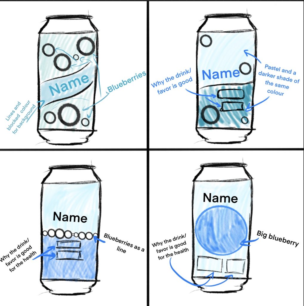
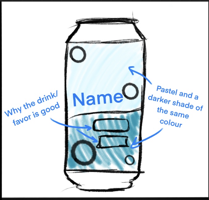
The chosen sketch that will be taken to Adobe Illustrator and designed in more details using colour schemes and such will be this one. This design sketch showcases the name clearly and due to the little illustrations of the blueberries that can vary in sizes it can allow the name to be bigger which will be helpful for elderly people to see it since most elderly have troubled visions and a little name or font wouldn’t be accustom to their needs.
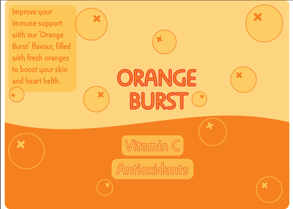
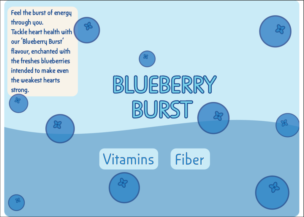
For the name of the brand I have chosen to call it ‘BURST’ and have the different flavours of the drink be called ‘[FLAVOUR] BURST’ to symbolise the burst of energy and health factors that the drink will bring using high quality ingredients.
This is the final label for both the blueberry and orange flavour, made using Adobe Illustrator and the previous research discussed in this post. Darker colours used for the outline of the names so that it makes it pop out more for elderly who might have bad eye sight.
1 – Seniorchatz. What fruits are good for the elderly? Available at: What fruits are good for the elderly? [Accessed 07 March 2025.]
2 – Lisa Salmon (2025) Should you wear bright clothes as you get older? Available at: https://www.greatbritishlife.co.uk/magazines/national/24935171.wear-bright-clothes-get-older/#:~:text=Older%20people%20may%20prefer%20warmer,due%20to%20sensitivity%20to%20brightness. [Accessed 07 March 2025.]