When looking into Tufte’s prospective of using color, he mentions in a reply to a post (1) that when dealing with using colors that are differentiable from one another and making sure that viewers can still tell the colors apart the designer should ask themselves ‘does it work as a gray scale?’ In an article (2) it’s talked about how Tufte talks about using colors with good ideas, using them sparingly. With this in mind I plan to use one colour (shades of blue) but in different shades and hues in my label design instead of 5 different colours (blue, pink, etc.) to create simplicity for the viewers.
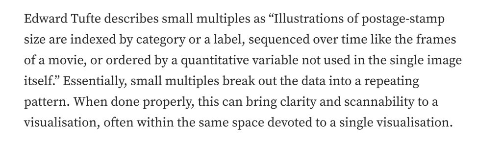
From reading an article (3) that talks about Tufte’s theory about small multiples I understand that Tufte means small multiples as a sequence over time, using small changes to continue a scene like in movies. I will use this in my animation by changing the position or rotation of my cans. This will help with keeping the viewers’ attention on the cans, especially when using different multiples such as fruits. The change of the rotation or position will be the small multiples that will create a sequence.
When looking at Edward Tufte’s website (4) there he talks about visual explanations. This focuses on using narrative with pictures to represent a mechanism or motions, effects and processes. He explains this furthermore in this book ‘Visual Explanations’ on page 159 (found information on his post (4)). This can be used in my work by using different imagery and effects to convey a narrative to the viewers, such as making it easier for the viewer to understand the narrative that I am going for with the different scenes, this could be added by text of the ingredients used in the can, using time with the scene to convey the message long enough for the viewer to see and understand it.
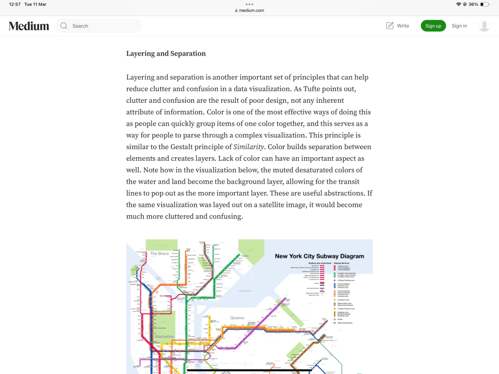
For the layering and separation part of Tufte’s theory, this article (5) uses Tufte’s theory to explain that layering and separation is an important principle to consider when doing design work. By layering and separating pieces of information, it helps reduce ‘clutter and confusion’ and make it easier for consumers to understand the piece of work without getting confused. An effective way of making layers and separation is by using colour. Due to the human eye grouping colours together, this helps with simplifying a complex design.
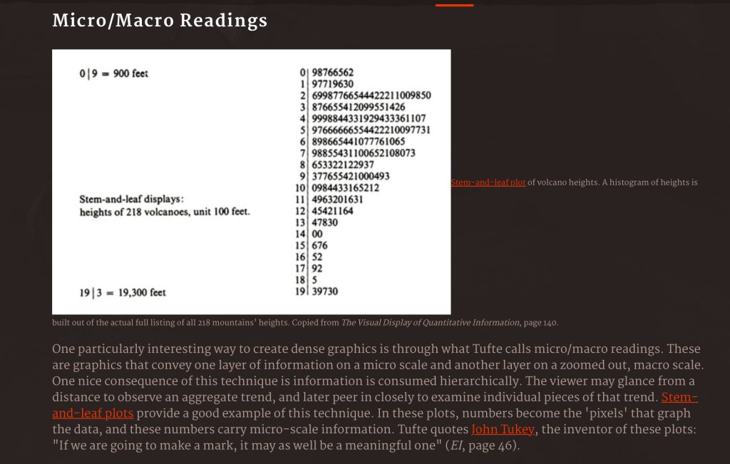
The final theory of Tufte’s that I hope to incorporate in my work is Tufte’s theory of micro/macro readings. Using an article (6) that explains Tufte’s theory of micro/macro as ‘graphics that convey one layer of information on a micro scale and another layer on a zoomed out, macro scale.’ This could be used in my work by changing the position of the camera to show a macro scale of the scenes. Going from micro to macro that way.
1 – Paul Vallee (2004.) Generating n Optimally Differentiatable colour. Available at: Generating n Optimally Differentiatable colours | Edward Tufte [Accessed 11 March 2025]
2 – Favorite Medium (2019.) How to Use Color in Data Visualization. Available at: https://medium.com/fm-stories/how-to-use-color-in-data-visualization-829d6f0e70b4 [Accessed 11 March 2025]
3 – Jason Lockwood (2017.) An introduction to small multiples. Available at: https://medium.com/@jasonlockwood/an-introduction-to-small-multiples-e0a5bd1efe88 [Accessed 11 March 2025]
4 – Edward R. Tufte (1996.) Visual Explanations: Images and Quantities, Evidence and Narrative. Available at: Visual Explanations: Images and Quantities, Evidence and Narrative | Edward Tufte [Accessed 11 March 2025]
5 – Blake Williford (2016.) Information Design. Available at: https://medium.com/@blakewilliford/information-design-9-29-ee995efb584e#:~:text=Layering%20and%20separation%20is%20another,source:%20Wikimedia%20Commons) [Accessed 11 March 2025]
6 – Phillip Isola (2009.) Design Principles from Tufte. Available at: Design Principles from Tufte – Wolfire Games Blog [Accessed 11 March 2025]