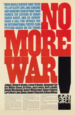
When looking at graphic design examples in the post war period, one stands out and that is ‘Avant Garde magazine’s anti-war poster contest’ (1) designed by Herb Lubalin in 1968. The poster has strong use of colour theory to bring the viewers eyes to the message the designer is trying to portray which in this case is to not create anymore wars. The scale and colour of the words ‘no more war’ make them the focal point that the viewers eyes immediately focus on. Alongside that there is a paragraph in blue that talks about a quote that says how men would rather stay home then go to war. The contrast between the urgent red and the calm/electric blue creates a hierarchy where the first thing the viewers see is the red text then the blue. Alongside using colours to catch the viewers’ attention the designer has also used icons/signals such as the exclamation mark in black. The exclamation mark creates a sense of urgency and importance to the piece that makes it feel more important. Finally, the font that is used reminds me of the font ‘impact’, with a font that is so bold and has volume it makes it feel like there is importance to the words, if the designer used a more Serif like font the feel and message wouldn’t be perceived as urgent. Overall, this example showcases how colour and typography alone can create a cohesive piece of work that can portray the designers’ thoughts and feelings about a certain topic (in this case war) perfectly.
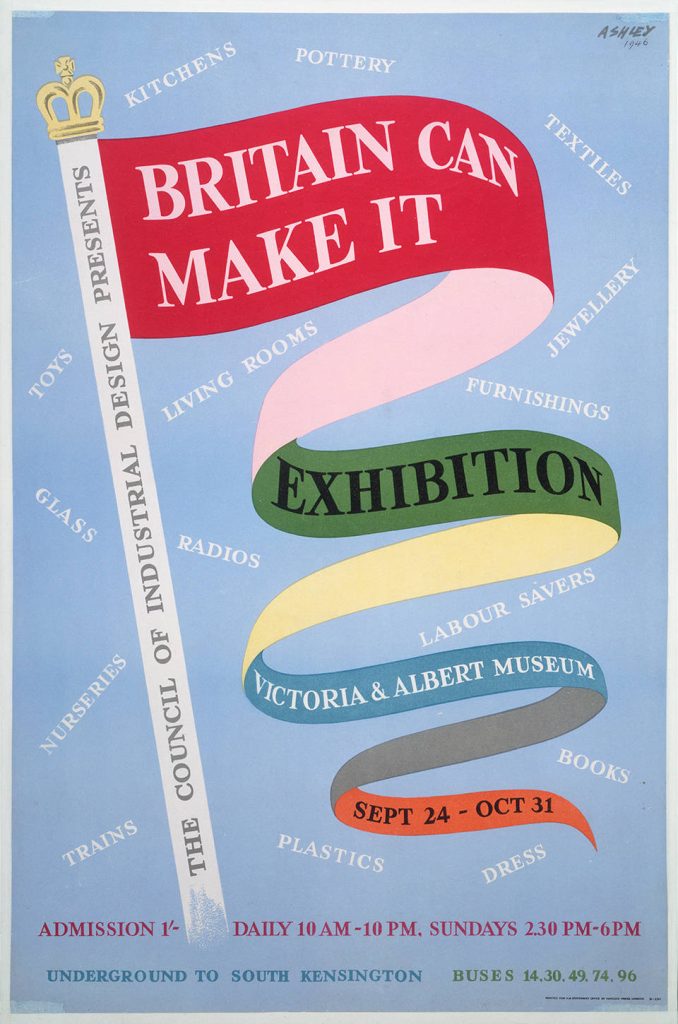
Another poster that is well known in the graphic design world is the ‘Britain Can Make it’ poster (2) created by Ashley Hayvinded. This poster was created to promote the exhibition in the London Museum, this was after the war, so Britain was facing the consequences of it, having debt, low morale and overall facing difficult social challenges. This design uses both secondary and primary colours, creating a vibrant feel to the design that was at odds with the current emotional state of the people but because of that the impact it had on audiences was grater. The overall fell to the design is bright, optimistic and free since the typography and colours are in the shape of a flag to show that Britain will still stand even after all the difficulties it has faced. The promotional aspect of the design is strong with the name of the exhibition being the focal point of the designs since it’s the biggest in scale, then the exhibition itself, then location and finally date. The way the flag is spread guides the audiences’ eyes down from the top to the bottom to make sure that all the information is received by the audiences.
1 – Philip B. Meggs (2010) Graphic design, 1945–75. Available at: Graphic design – Postwar, Typography, Visual Communication | Britannica [Accessed 04 May 2026]
2 – Ashley Hayvinded (1946) ‘Britain Can Make It’. Available at: ‘Britain Can Make It’ · V&A [Accessed 04 May 2026]