First Design
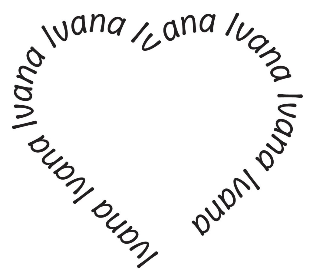
When designing the first typographical name logo I wanted to focus on expressing love with my design. I created a heart using the rectangle tool and anchor point tool. A heart because a heart represents love. Then I used the type on path tool to write my name on the outline of the heart, creating an outline of a heart with my name instead of using lines.

For the font of my name I used the typeface ‘Annai MN Regular’. The typeface is rather simple font that looks comic like. This specific typeface is used because I want the viewers to focus on the shape of the heart which is why I didn’t use a more complicated typeface. The colour used is simply black due to the same reason of not complicating the design.
Second Design
For my second typographical name logo the use of the typeface ‘Modak’ has been used which gives the bubbly effect on the letters. I also used a gradient to create a more seamless and soft looking transition with the colour. I used the colours: yellow, amber, orange, magenta and purple, these colours are mainly seen in sunsets and when thinking of sunsets freedom comes to mind.

I wanted to portray that aspect of freedom with the choice of colour and typeface. I also used yellow for the outline of the letters to create a softer look to the overall design. Yellow, orange and amber being warm colours. Warm colours evoke energy and positivity, whereas the magenta at the end of the gradient is a cool colour. Cool colours bring out more relaxing feeling and calmness. Using mainly warm colours makes the design more cheerful but the cool colour at the end makes it feel more calm and it creates contrast.