First Design
For my first self-promotional poster I wanted to focus on something very person to me, which is my Bulgarian culture and side. To achieve that and to create a design with that in mind I used a gradient for the background with the three colours of the Bulgarian flag: white, green and red. Using the same colour scheme of the Bulgarian flag for the whole design. Using the three colours at full capacity to create a ray of sunshine from behind the portray that is the Bulgarian flag.
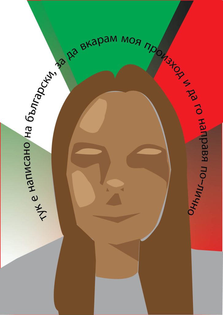
I created a very simplistic portray using the pen tool in illustrator and using shadows to show where certain features of the face are, like the nose and eyes. To make it even more in touch with my Bulgarian side, I wrote in Bulgarian ‘here it’s written in Bulgarian, to bring in my culture and make it more personal’ in a circle around the head of the portray.
Second Design
For my second self-promotional poster I wanted to focus on my personal hobbies that I enjoy doing. Taking photos and putting them in photoshop using hue/saturation and brightness adjustments to make the colours pop out more on the illustrator file. The background was also created in photoshop using a black rectangle the size of the artboard as a base and then using the brush effects to create golden sparkles.
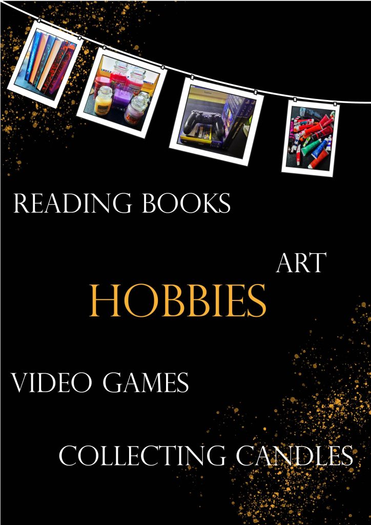
Then in illustrator I used the pen and rectangle tool to create polaroid looking design that is hanging up from a line. This makes it seem like a showcase of my different hobbies and then using the ‘Perpetua Titling MT’ typeface to write the hobbies names and also the word ‘hobbies’ in the middle so that the viewers immediately understand what this design is about. Using the same gold used for the background sparkles, for the ‘hobbies’ to make the word pop out even more as a focal point.