Good Example
This is a good example of a conceptual design about language barriers because it uses the two ideas of an actual barrier and the idea that the barrier stops people from communicating with each other affectively. The designer has created these blocky people which represent different people that are struggling and the expressions on their faces is good at expressing the stress and worry about language barriers and not being able to understand a language. The design not only communicates information visually, but it also successfully portrays what it feels like to experience a language barrier. The use of soft, pastel colour scheme makes the design feel more casual and it doesn’t overwhelm the viewers eyes (like how if bright, neon colours would have taken away from the message due to the brightness and intensity.)
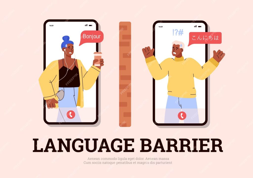
Furthermore, the usage of simple typography that isn’t too bold or fancy looking also allows the design to shine with its message. The fact that the designer has used phones as a background for the characters shows that language barriers can also happen, only and just because there is google translate doesn’t help the problem and people still experience language barriers even online. The barrier design in the middle is a great representation of the inconvenience and troubles a language barrier can create. Using something so straight forward as a actual barrier helps the viewers to immediately understand what the design is about. It catches the viewers eyes, even on a busy day people would see this and recognise the message. Overall, this is a good example because it uses different elements of colour, typography, design and composition to portray a message to the viewers that is easily understandable and the target audience can relate to.
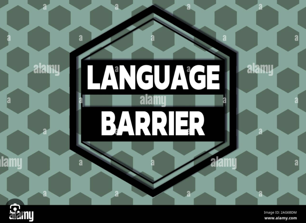
Bad Example
This is a bad example of conceptual design about language barriers because it doesn’t combine two ideas the best way that it could. The dirt, soldier like green colour doesn’t suit or translate any meaning to the design. The hexagons are a bit confusing since when the viewers look at the, it doesn’t really have any connection to language barriers so they don’t make sense in this design. The typography used isn’t bad, a bit simple but it’s the focal point that catches the viewers eyes due to hold bold the font is. The design looks more like it would be about a military camp rather than language barriers. The composition is not bad, it looks symmetrical and it does guide the viewers eyes well. Overall, this is a bad design because it doesn’t communicate the message it wants to, the colour really throws off the idea and purpose of the design off.
Bad example
My Redo
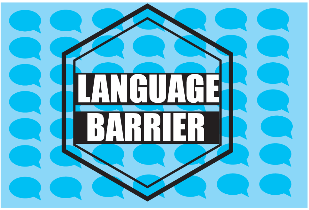
When I redid the design I focused on changing the colour and changing the hexagons to something that will communicate the message of language barriers to the viewers better. For that reason I used text bubbles instead of the hexagons, because text bubbles are often associated with communicating with someone else and people with language barriers will have troubles with communicating with people. I also changed the colour from dirt green to light blue with dark blue text bubbles. The light blue colour represents communicating better then the green. I kept the hexagon in the middle and the typography the same (or close enough) to the original because it creates a good focal point that catches the viewers eyes and the black outline makes the text pop out a lot more and it creates hierarchy for the viewers eyes.
Rumka_vodki. Banner about language barrier flat style vector image. VectorStock. Available online: [Banner about language barrier flat style Vector Image (vectorstock.com)]
Artur Szczybylo. Handwriting text Language Barrier conceptual photo difficulties in communication Speaking different language Hexagonal figures design modern geometry. Alamy. Available online:[https://www.alamy.com/handwriting-text-language-barrier-conceptual-photo-difficulties-in-communication-speaking-different-language-hexagonal-figures-design-modern-geometr-image336972208.html]