Logo Redesign
Before starting with the low/mid and high prototyping for the OSHI website, the logo needed to be changed due to the different colour scheme I will be using for the website, and the logo must match the website colours so that it doesn’t throw users off visually.
Process:
When looking at the OSHI logo it makes me think of a blossom flower with the design of petals. The logo is original and personal to the OSHI campaign which is why I decided to keep the new logo very similar to the original but with some small changes. To start with I used Illustrator to outline the OSHI logo keeping the same style and idea as the original logo. When doing the redesign there was some white space in the middle of the design where all the flower petals were pointing to, with the idea of support and overcoming difficulties that OSHI is aiming to do with their mission statement, I added a small heart in the middle of the logo so that it visualizes that the petals are coming from the heart.
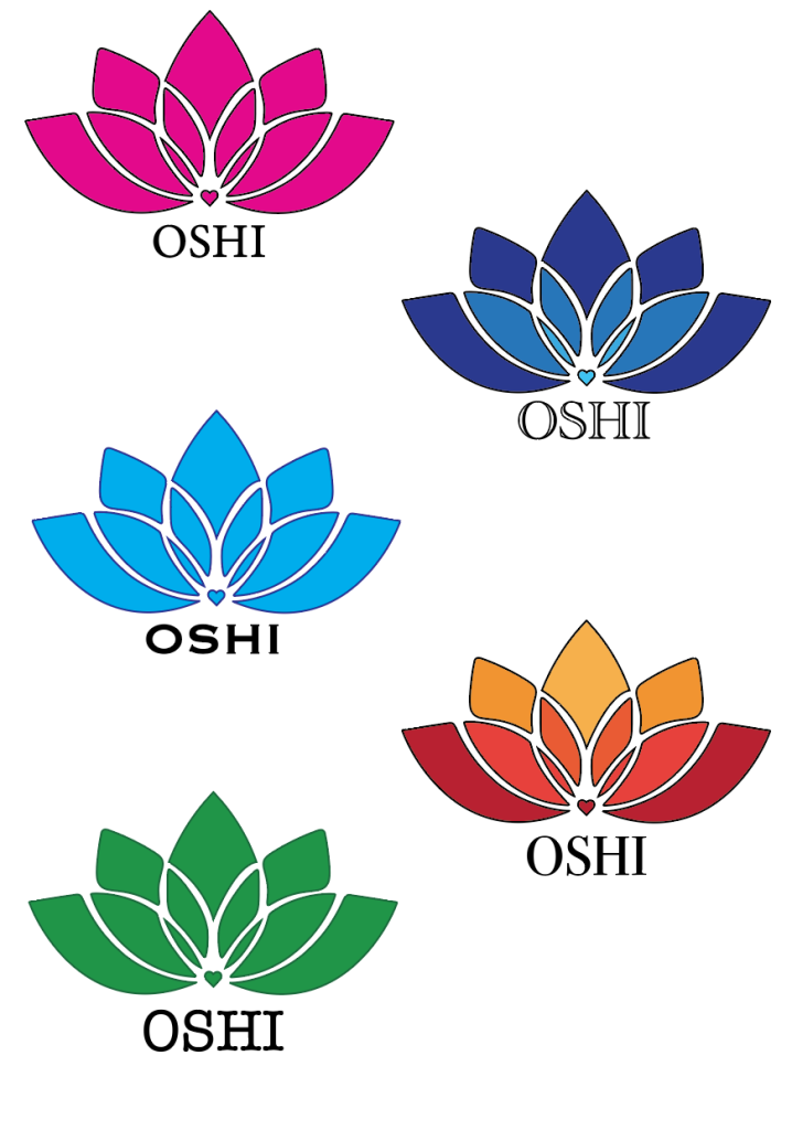
After the design was finished it was time to decide on the colour and font of the logo. The font was crucial to decide at this stage in the process since this font will be used throughout the whole website in the prototyping and finalizing stage. There were five choices of different colours, three are solid colours like the original OSHI logo that is a solid blue, the last two versions are both gradient of colours, the blue one that is starting with the lightest from the heart so the gradient is going from the inside and getting darker towards the edges and the other one is the darkest shade from the bottom and getting lighter at the top.
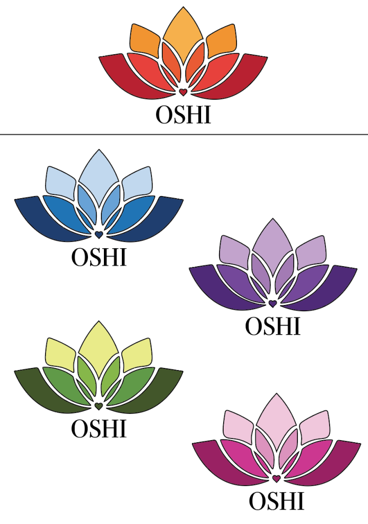
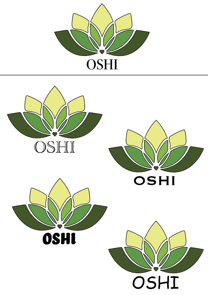
From the first stage of the process the final choice for the logo was the gradient from top (lightest) to bottom (darkest). With the colour style for the font being chosen the next step in the process was to choose the colour and shades for it. There was a choice of five different colour combinations, with blue looking calm and professional but due to blue being a cool colour it made the logo feel too professional and corporate for the message that OSHI is trying to get across. Therefore, the final colour choice was the green, with the different shades of green looking more welcoming, as well as green being often associated with nature which would make the users think of health which fits with the OSHI brand of wanting to support and help people get the help they need with their struggles. Finally, after deciding on the colour scheme of the logo, the final step was to choose the font that will not only be representing the logo but guide the whole website, there was a choice of five different style fonts, but the font that was chosen at the end was ‘Copperplate’ due to it being a wedge-serif font (the narrow small lines pointing outwards of the letters) making it look simple with a touch of sophisticated that makes the logo and the website feel both professional but also welcoming to the users.
Final redesign:
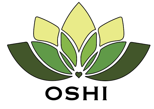
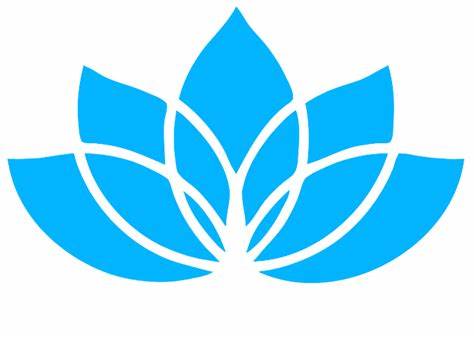
The final re-design of the logo combines all the steps to show the final outcome which still looks similar enough to the original that it keeps the same message but with some changes. The outline strokes of the logo are small to ensure that there is enough white space between the elements of the design so when a user looks at the logo on different screens the logo doesn’t seem overtaken by the black strokes.
Prototype
Sketches:
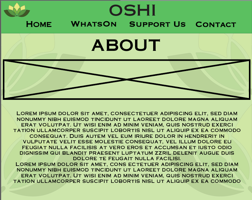
To start with the prototyping, the first thing that was done was to sketch out different compositions for all three of the different screens that were going to be used for mid and high fidelity. The logo throughout all the sketches stayed in the same place on the left-hand side like in the original OSHI website. When thinking about composition and placement there must be enough spacing and white space, so the website does not become overwhelmingly busy for the user and so that the text does not mush together and make it hard to understand and read.
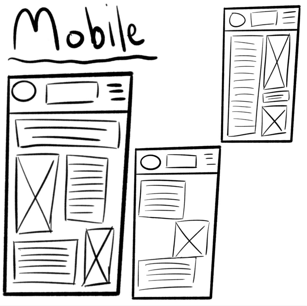
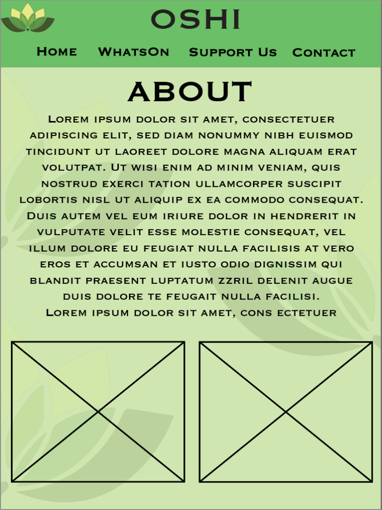
Mobile: (750 x 1334px)
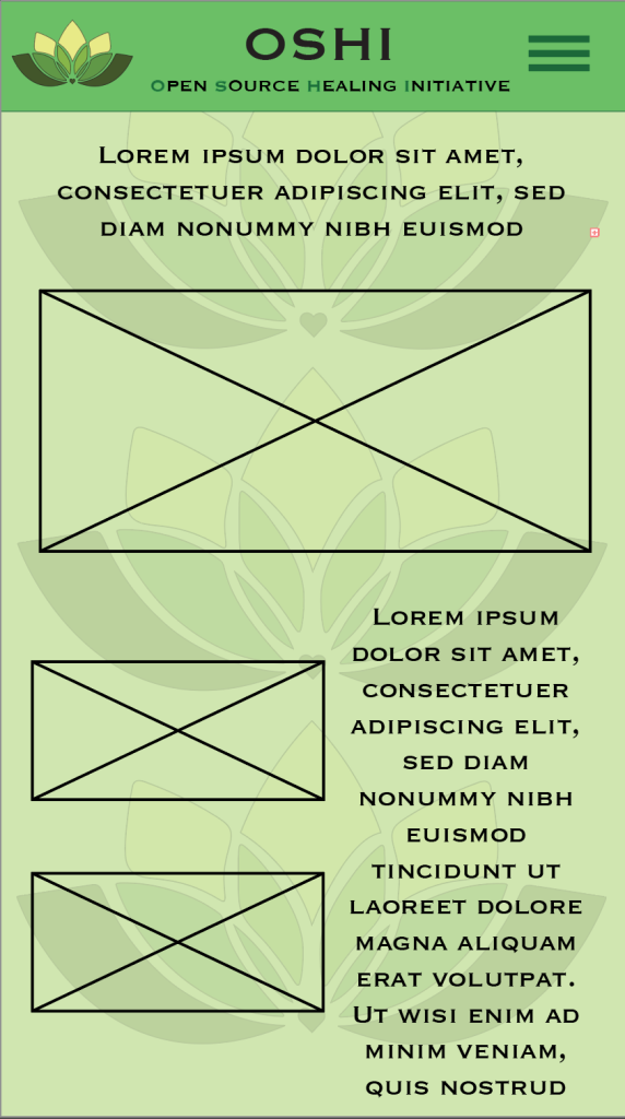
After the sketches it was time for the mid fidelity prototypes for all three of the screen sizes. Firstly, the mobile dimensions are 750 wide and 1334 tall, with this screen size being the least wide the images (the squares with crosses are where the images will go into in the high-fidelity prototype) will be small so the placement and size of the text will be of importance to make sure that the users can still read the text perfectly fine without having problems from the images. In all three of the mid-fidelity prototypes there is a boarder at the top but only in the mobile version there is the official name of OSHI which is Open Source Healing Initiative, due to the hamburger menu that the phone has on the side I decided to use the full name of OSHI to put under the name in the boarder, highlighting the first letters of the name to spell out OSHI. Overall, of the prototypes there is the green colour scheme that shapes the whole website, using green to promote health and using the logo as a pattern at the back to make the logo more recognizable for the users.
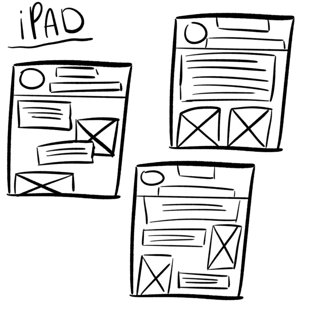
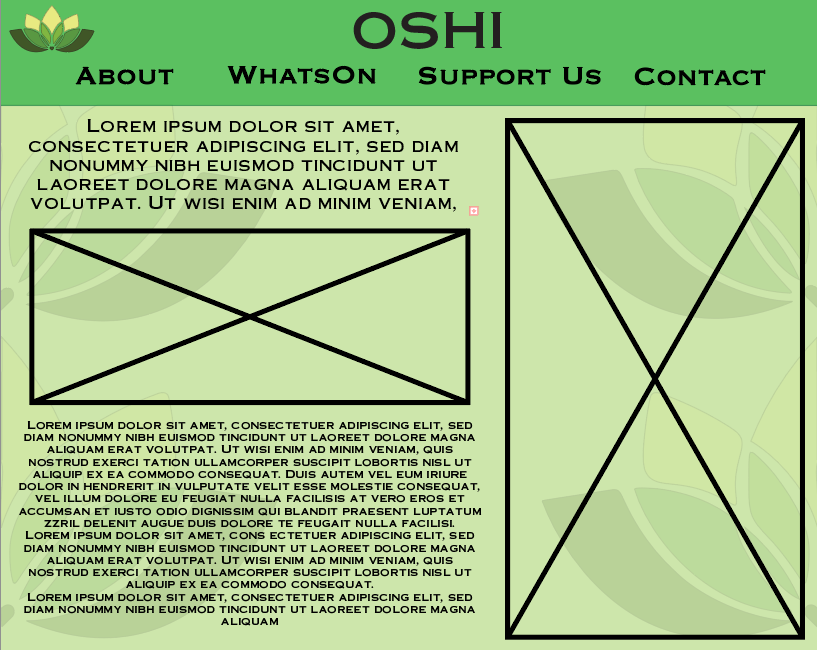
Tablet/iPad: (2048 x 2732px)
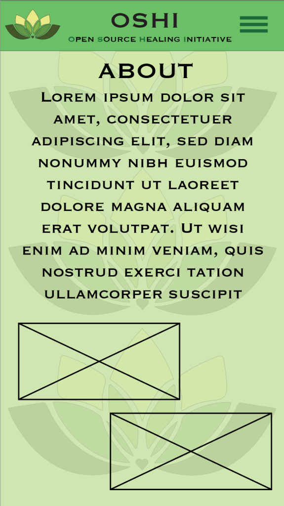
For the iPad/tablet mid-fidelity the background patterns of the logo was changed instead of it being lined up in the middle now it was on the sides of the website due to the bigger dimensions used for the iPad if the pattern was in the middle like in the mobile it would have left way too much white space on the corners which will take away the users attention, therefore the logo was cut in half and put on the sides, still creating white space in the background without taking away from the main focus which is the text and images, for the iPad there is no hamburger menu due to it being wider the mobile, so instead of a hamburger menu there is all the different buttons that users can press to bring them to their desired pages like ‘about’ and ‘contact’ with the text and image sizes being bigger than the mobile version.
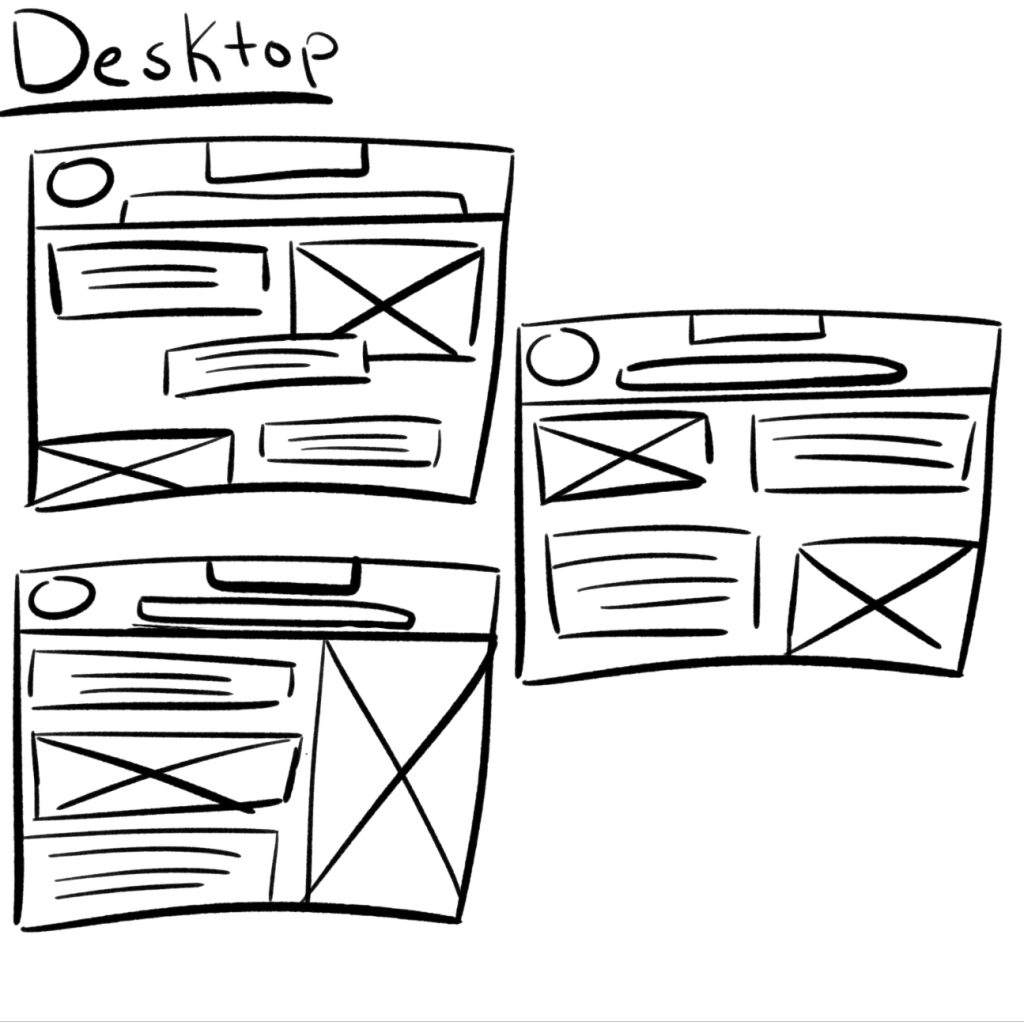
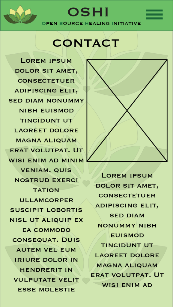
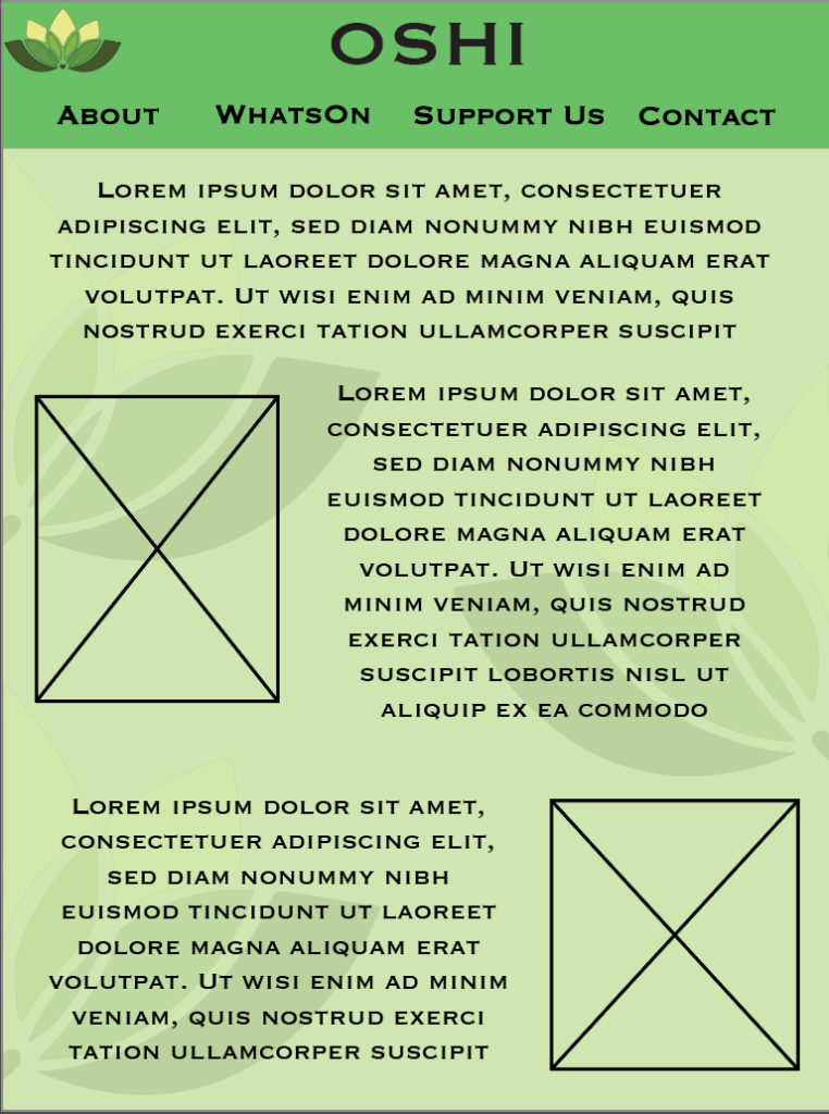
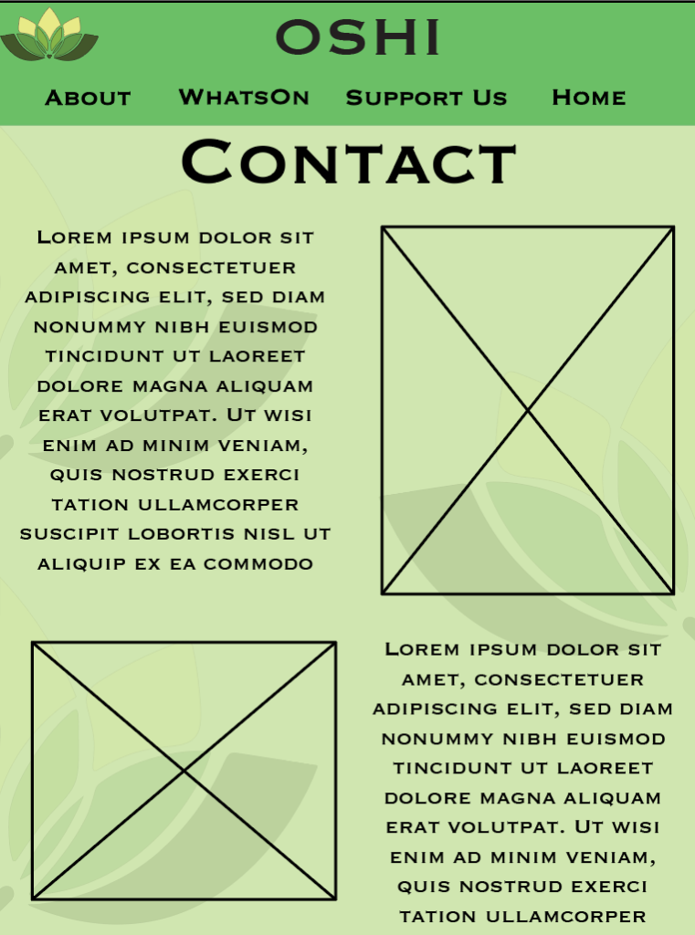
Desktop: (1280 x 1024px)
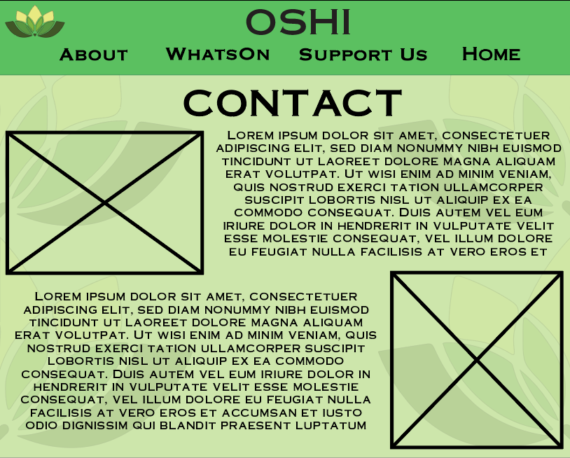
For the final mid-fidelity, the Desktop version once again has different background patterns with now the logo being once again cut in half but there being two on each side creating a lot whiter space in the middle of the page. Like the iPad the Desktop has buttons on top in the board rather than the hamburger menu, since the Desktop is the biggest largest in terms of resolutions there can be a lot more text fitted in the space.
Overall, each mid-fidelity page has different composition so that I can see and visualize which composition will be best for the different dimensions and screens, with the colour scheme staying the same with small changes of the background pattern and boarded on top.
1 – OSHI (2024) Website. OSHI – The Open Source Healing Initiative in HULL UK. [Accessed 09 Dec 2024.]