Sketches
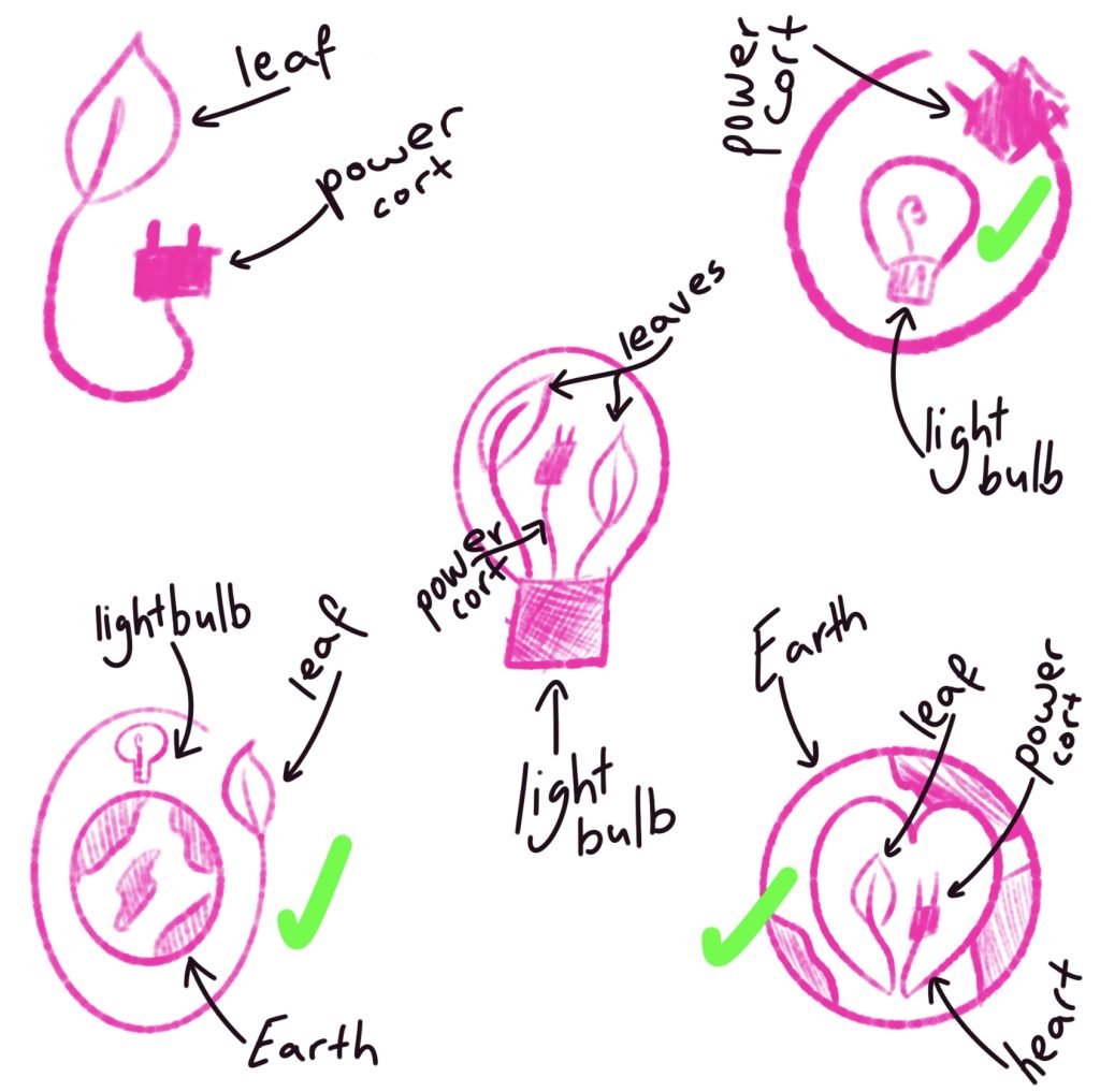
To start with the logo, the first thing was to draw up some sketches to give us plenty of options to work with. When thinking about eco-friendly energy the words that come to mind are ‘light bulb’, ‘nature’ and ‘Earth’. The sketches all have at least one element of those words so that the logo is easily recognizable and portrays the company’s goal and aim without words which will help emphasize the goal behind the company. After making five sketches in Procreate, the three chosen are ticked in green to take to the next stage.
720 x 700px
Moving on after the sketches, importing the sketches to Adobe Illustrator using the pen tool to create the outlines of the logos. For the first one (top left) it’s the earth with a light bulb in the middle and a leaf around it, to represent that the planet needs energy and nature, with the typography at the bottom curling around the leaf to show that the company aims to bring nature friendly energy to the planet. Using the drawing tool to create the light bulb as well as using text wrap to make the text curl around the leaf line which helps with completely the logo instead of putting the text in the middle of the logo which would have taken away from the message.
The second logo (the one at the bottom) once again uses the Earth design, however instead of a light bulb this time inside the Earth is a cable in the shape of a heart with one end finishing at a leaf and the other at a cable to represent that the company does not only focus on being environmentally friendly but also on providing energy. The Earth was made with a circle shaped tool and the leaf and cable as well as the heart were made with the drawing tool. Once again, the text is with wrap to make it arch in the middle so that the name surrounds the Earth.
The final logo (top right) is the one that ended up being chosen for the website and promotional Instagram reels. This logo is a light bulb with the light source inside in the shape of a heart and the bottom half of the light bulb goes into a leaf. This logo is the one chosen for later use due to the simple but effective presentation of the company, with the combination of energy, nature and the heart in the middle. The text in this logo does not use text wrap, instead the text is at the top of the logo.
150 x 100px
All the logos were made using the brand colours, the pallets from the mood board were imported in Adobe Illustrator and swatches so that the colours are the same and stay true and consistent to the company’s look. There are two versions of the logos, one in higher pixels and one in lower pixels to show versatility with different size canvases.