After finishing with the mid-fidelity of the three different screen sizes I needed feedback from outside people that will be considered as users for this website, using their feedback and suggestions from the mid-fidelity prototype to help me change the high-fidelity prototype later on to match with users’ needs and wants, the main goal to make users feel welcomed by creating a welcoming and warm feel by the website that should also be easy to navigate for the older users that might not feel comfortable with technologies, due to the target audience of OSHI being so broad a lot of different aspects and different aged perspectives have to be taken into considerations which is why I asked multiple different age groups for their responses.
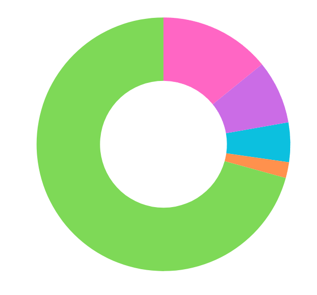
This pie chart shows in a visual way the colours that people liked based on the logo. As shown the majority of users agreed that the green colour looks the most suitable for OSHI. This was of great importance since the new website is heavily based on the chosen colour with the logo, background, even pictures.
After showing the mid-fidelity to both family and friends and colleagues the main issues that were brought to my attention were that the buttons in the boarded on the iPad and Desktop versions were hard to read for people with problematic visions due to the letters blending into the dark green boarder, another problem was that the background even though it has its capacity lower to make it easier for users to read the text it still felt too dark for some users. Another issue that was brought forward was once again to do with the boarder, the issue of it being too cramped with not enough spacing in between the different buttons making it difficult to read for people that once again struggle with their vision or older users.
For the mobile version an issue of the composition was brought forward, the issue of the text being next to the image makes it feel cramped and busy especially if smaller images are used that might get their resolution messed up when being squashed in specific measurements for the text next to it. A final issue that was brought up is that the text being centered for reading makes it difficult for the users to fall the text, the hierarchy of the text reading in the middle making it hard for some users to focus and read the text correctly.
With all this feedback on the different screens the next step is to implement all of this into changes that will be all put together in the final high-fidelity prototypes of the three screens with making sure that the opinions of the users are considered to ensure that the high-fidelity prototype is well received with users.