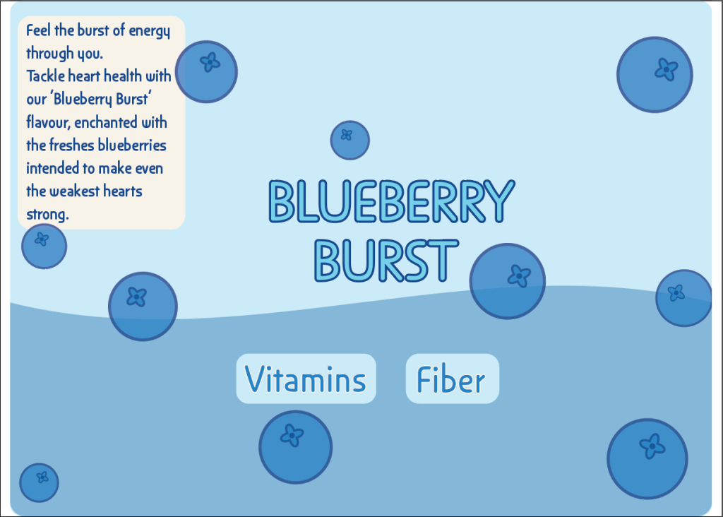
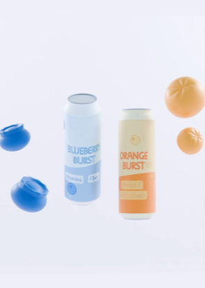
After finishing the animation and label for the project. Looking back at the last post about Edward Tufte’s usage of colours ideas. I have used the principle that I said I will, using the same colour but different hues and shades of it for the designs instead of using multiple different colours. This helps with not overwhelming the consumers with colour that may be too much for them. Using Tufte’s idea of using colours with good ideas and sparingly to emphasis a point across through the design to consumers.
With the previous post in mind, the animation has a lot of small multiples. Using the different variables such as the cans and fruits to change even slightly in position and rotation creates a sequence of small changes that are barely noticeable to the consumers but it follows Tufte’s theory of continuing a sequence over time and it makes the consumers pay attention to the different variables in the scene because they keep moving but not too much in a way that would be overwhelming for the viewers eyes.
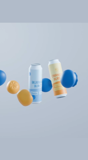
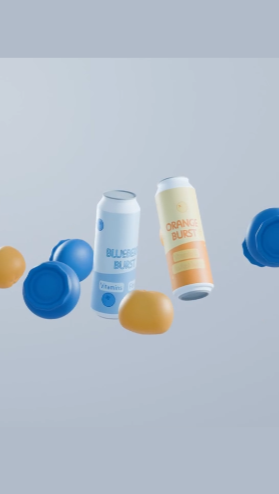
(How the cans rotate, this change is within a second from each other, just a slight rotation.)
After doing the animation, when thinking about using Tufte’s narrative over space and time, I went with a different approach. Instead of using text of the ingredients like I wanted to in my previous post, I used the fruit inside the flavors to convey a message. I did that by animating the cans coming into view alongside their respective fruit flavor. So, for the blueberry one, the blueberries came up on that can’s side whereas the oranges did on the orange can flavor side. This uses the time in the scene to convey the message of what the cans flavours are using different elements than only the words on the labels but also show visually.
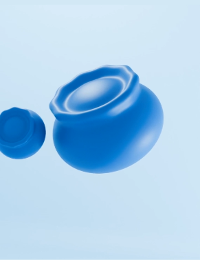
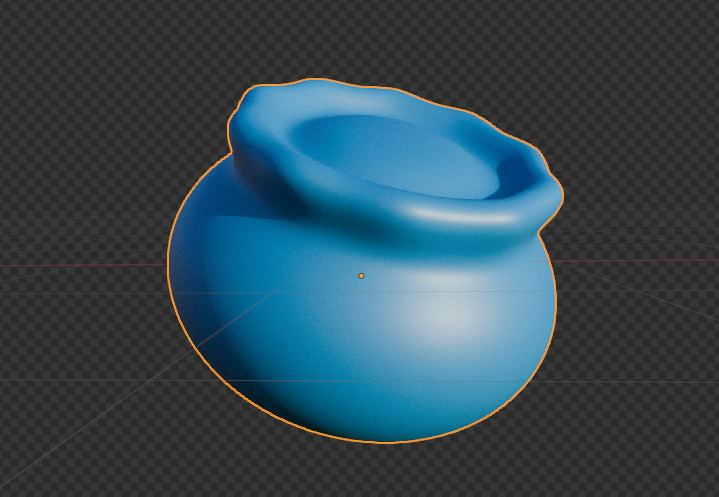
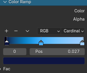
When doing the design for the can and the fruits in Blender, I kept in mind Tufte’s theory about layering and separation. With the idea of using colours and lighting to create layers for the fruits, especially the blueberries due to the 3D modelling of them. Using a colour ramp to create a gradient, using Tufte’s theory of using colour to create separation, this gradient helps with creating more depth and shadows to the blueberry so it’s easier for the viewers to tell it’s a 3D object without being confused with the lighting.
For the final theory of Tufte’s I have used it in one of the scenes where the camera is moved back ever so slightly to give the growing blueberry a better scale to expand in. Using the camera position to capture the micro to macro scale change. Having the blueberry becoming macro from micro and taking up a lot of the scene space, the camera is moved back to let the scene expand along with the blueberry.