Idea Generation
(Mind Map of different style ideas for a series of posters against vaping.)
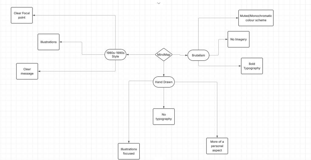
The first thing I did was to create a mind map to write down some ideas for the type of style I want to go for in the experiments and final product. There are three different ideas, brutalism which would create more interest visually in the audience, hand drawn which will focus more on illustrations and design rather than typography and would have a more personal touch to the feel of the work or 1980s-1990s style that would be more like Biman Mullick’s work with both typography and illustrations but this style might not be received well by the target audience and it is something that is already out there.
The final idea for the campaign is to create a series of posters that show the cycle of how people get into vaping, how it turns into a addiction and finally the consequences of that addiction.
Styles
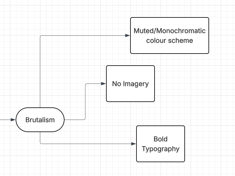
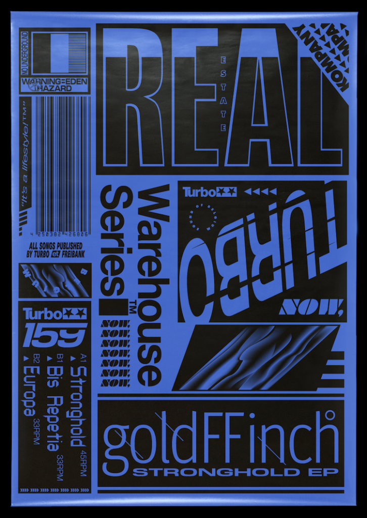
The first style Brutalism focuses on raw, minimalistic and jarring aesthetic that has gotten more popular in recent years which is why I think it would be well received by the target audience. Brutalism focuses on bold typography, ragged unconventional layouts and jarring visuals that creates an interesting and in your face designs that would portray the anti-vaping message efficiently without using gruesome shock images, instead bringing the audience’s attention with unpolished visuals, it can be used to show the ugly side of vaping to the audiences.
An artist that uses Brutalism that inspires me is David Rudnick.
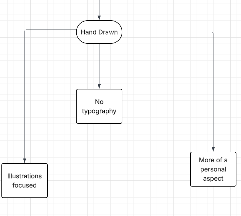
The other style, hand drawn, focuses on a more personal touch for the audience since its hand made by the creator. While it’s a good way to make the audience feel more connected to the piece of work, I don’t think it would portray the message I want to portray in the same way that Brutalism would.
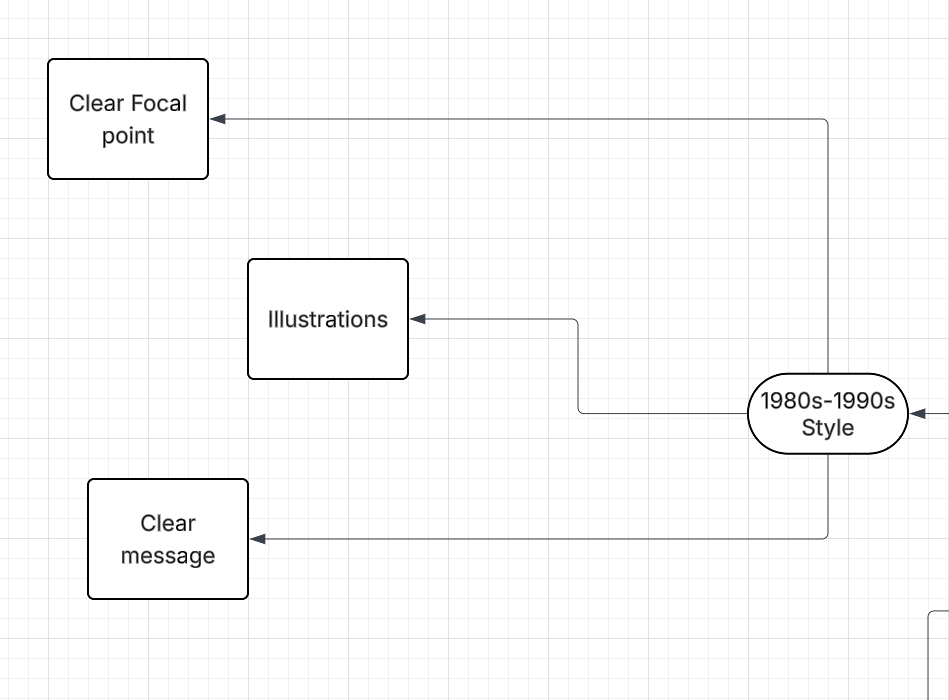
The final style that is from 1980s-1990s like Biman Mullick would have been perfect if I was focusing the message to older audiences that would have been able to recognise the style and be more interested I in it. But since I am focusing on the younger audience I don’t think they would be as intrigued by this style of work.
Therefor, the final style that was decided for the whole campaign is Brutalism, since it would best grab the target audiences attention and also explore the anti-smoking posters in a different unique way.
Visual Exploration
Before going on to creating the posters I wanted to prepare as much as possible, therefor I did some sketches in Procreate to get an idea of how the composition and layout will look, blocking out space to help visualise how the posters will look.
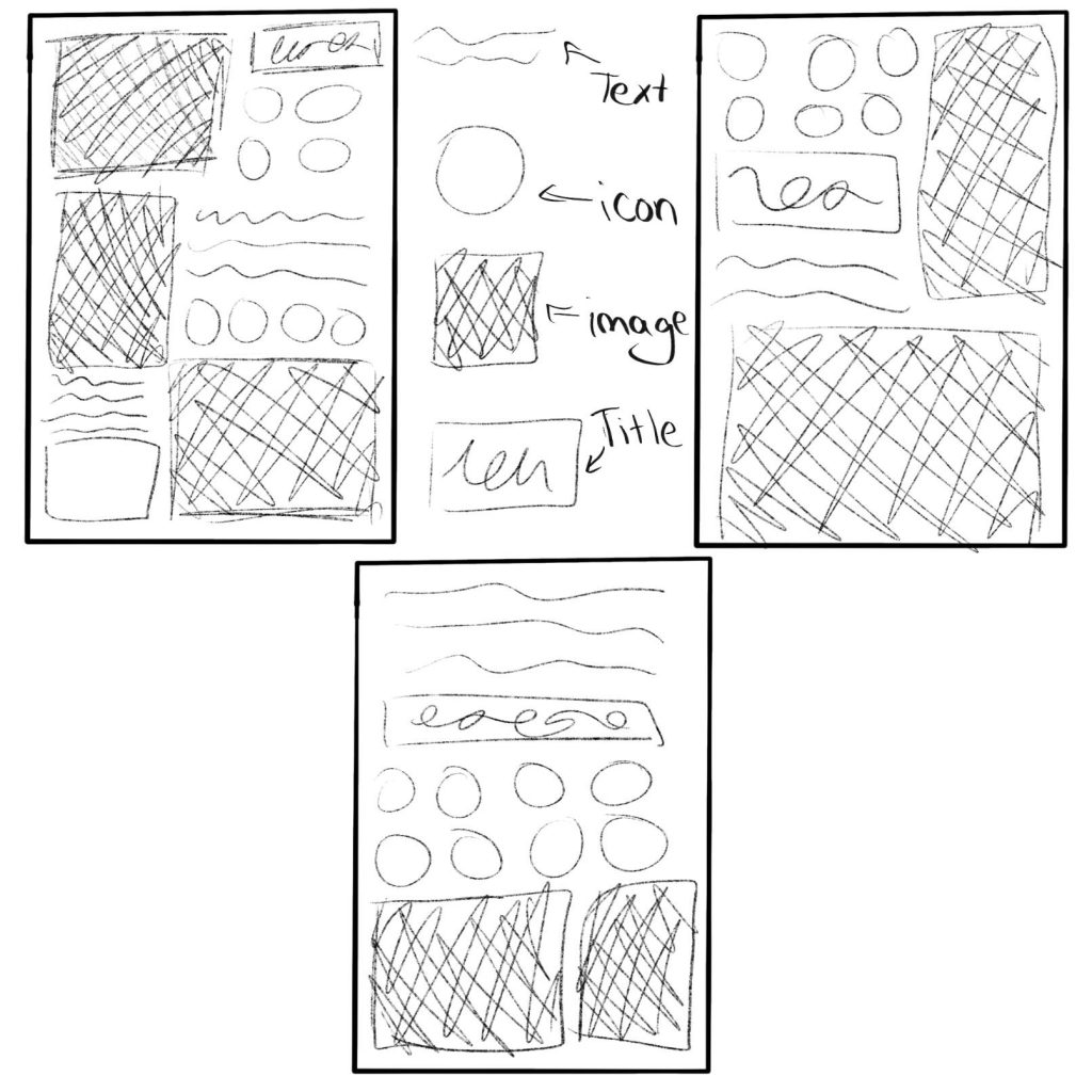
After the sketches and getting a rough idea on the composition of the posters I wanted to look into what colours, type fonts and elements to include in the posters. For colour schemes, brutalism focuses on one to two colours per design, since too many different colours take away from the overall design and message, due to that the posters would either be in a single colour scheme or simple black and white to make sure the audiences focus on the message of the work. For type fonts, brutalism uses bold thick fonts that bring attention to the typography since that is the focal point of the design that the audiences will focus on first and the font needs to reflect that. For elements that will be in the posters, there will be icons to visualise the message to the audiences as well as imagery.
1 – Anna Chayasatit (2016) David Rudnick. Available at: People of Print: David Rudnick [Accessed 03 May 2026]